
Landscape Painting Order Simulator
Have you ever stared at a blank canvas, brush in hand, wondering where to even begin? It is one of the most common dilemmas for artists. Do you start with the majestic mountain range? The detailed trees in the front? Or perhaps the dramatic clouds overhead? The answer might surprise you. For most traditional landscape paintings, especially in oil or acrylic, the general rule is simple: paint the background first. This means starting with the sky, then moving to distant mountains, then mid-ground elements, and finally saving the foreground details for last.
This approach works because it allows you to build depth naturally. By laying down lighter, cooler colors in the back and progressively adding darker, warmer, and more textured layers in the front, you create a sense of three-dimensional space on a flat surface. Think of it like building a house; you don't put up the roof before the foundation. In art, your "foundation" is the distant horizon, and your "roof" is the intricate detail right in front of the viewer's eye.
Before we dive into the specific steps, it helps to understand why this order matters. If you paint the foreground first, you risk blocking out the view of the background. You also lose the ability to let colors bleed and blend softly in the distance, which is crucial for creating atmospheric perspective. When I was learning to paint here in Wellington, looking out over the harbor, I quickly realized that trying to capture every blade of grass first left me with no room to adjust the mood of the sky. Starting big and working small gives you control.
The Logic Behind Background-First Painting
Why does the background come first? It comes down to two main principles: value structure and color temperature. In almost every natural scene, the air between you and distant objects filters light, making faraway things appear lighter, less saturated, and bluer (or cooler). Nearby objects are darker, more saturated, and warmer.
By painting the sky and distant hills first, you establish the lightest values and coolest temperatures on the canvas. As you move forward, you can layer darker, richer pigments over these dry or semi-dry layers. This creates a visual recession. Your eye is drawn to the contrast of the dark foreground against the light background. If you reversed this, placing dark foreground elements first, you would have to carefully paint around them to keep the sky clean, which is tedious and often results in stiff, unnatural edges.
Consider the concept of "atmospheric perspective." This is not just an artistic trick; it is how human vision works. The particles in the air scatter light. When you paint the sky first, you can use wet-on-wet techniques to blend horizons seamlessly. There are no hard lines where the sky meets the distant land. Later, when you add the foreground, those hard, crisp edges will pop against the soft background, enhancing the illusion of depth.
Step-by-Step: The Standard Landscape Order
Here is a practical workflow that applies to most plein air (outdoor) and studio landscape paintings. This sequence minimizes mistakes and maximizes depth.
- Block in the Sky: Start with the largest area. Mix your sky colors and apply them broadly. Don't worry about perfect cloud shapes yet. Establish the gradient from the horizon (lighter) to the zenith (darker).
- Add Distant Landforms: While the sky is still wet (if using oils or soft acrylics), introduce the silhouettes of distant mountains or hills. These should be slightly darker than the sky but still very light in value. Blend the edges so they disappear into the atmosphere.
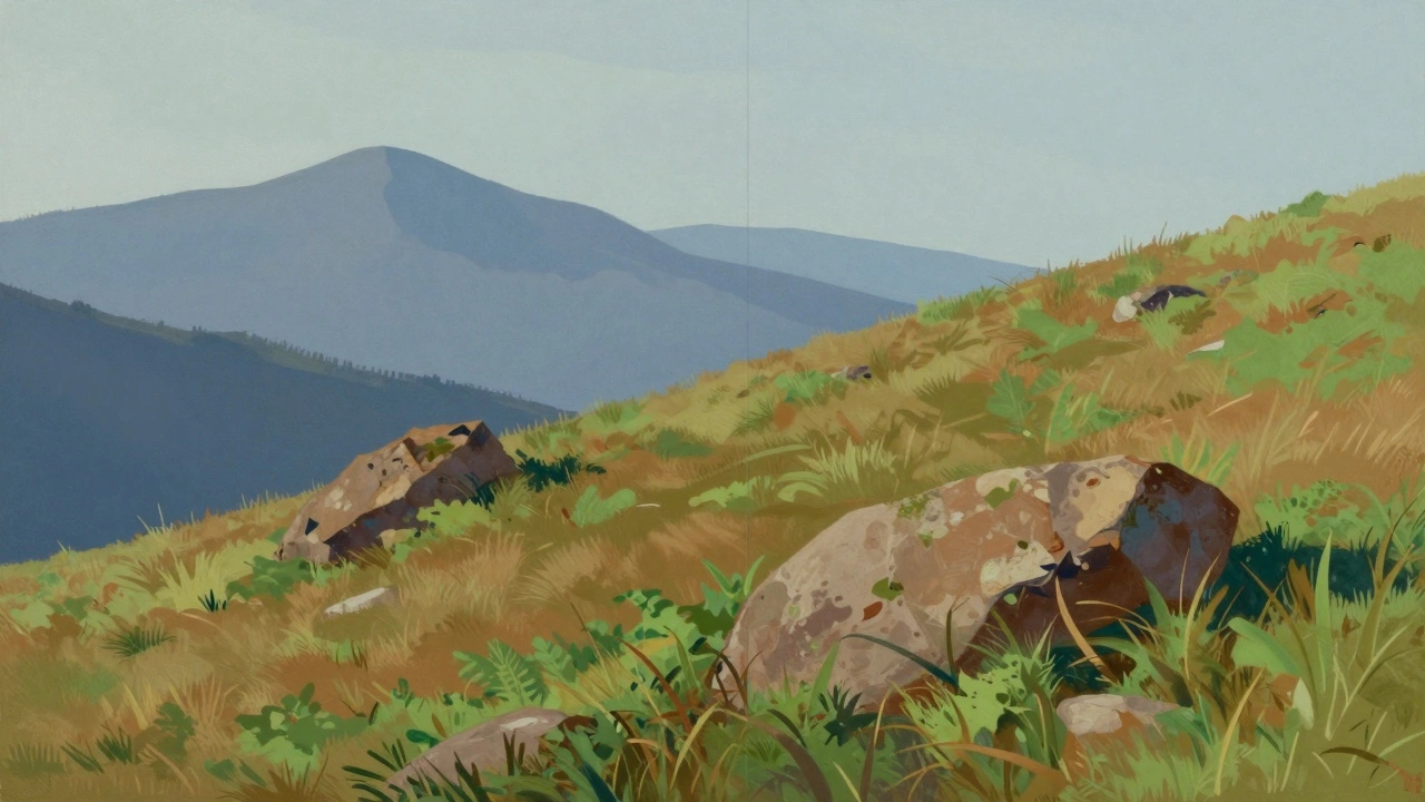
- Define the Mid-Ground: This is where the main subject often lives-a field, a lake, or a cluster of trees. These elements should be darker and more saturated than the background. Use broader strokes here. You can start defining tree masses without individual leaves.
- Establish the Foreground Base: Lay down the darkest values of your painting. This could be rocks, soil, or dense foliage. These areas anchor the composition. Keep textures loose at this stage.
- Add Details and Highlights: Now, go back through the layers. Add texture to the foreground bark, ripples in the water, or specific flower petals. Glaze transparent colors over dried layers to deepen shadows or brighten highlights.
This method ensures that if you make a mistake in the foreground, you haven't ruined the delicate balance of the sky. It is much easier to fix a dark patch in the front than to repaint a blended horizon line.
Exceptions: When to Break the Rules
Art rules are meant to be broken, but only when you know why. There are scenarios where starting with the background isn't the best choice.
Glaizing Over Dark Grounds: Some painters prefer to tone their canvas with a dark wash (like burnt umber or raw sienna) before starting. In this case, you are technically painting the "background" first, but it is a uniform base. Then, you might work generally all over, lifting out lights rather than adding darks. This is common in classical glazing techniques.
Wet-on-Wet Impressionism: Artists like Monet often worked alla prima (all at once), keeping everything wet. They might block in large masses of color across the entire canvas simultaneously-sky, ground, and water-all in one session. However, even then, they usually laid the sky tones first because they dry slower (in oils) or set the overall color harmony. The key difference is speed; you are not waiting for layers to dry between steps.
Foreground-Dominant Compositions: If your painting is mostly a close-up of a rock face or a forest floor with only a sliver of sky, you might start with the dominant element. But even then, you typically reserve the tiny bit of sky for last to ensure it remains bright and unaffected by accidental splatters from the heavy foreground texture.
Common Mistakes to Avoid
Even experienced painters fall into traps regarding painting order. Here are a few pitfalls to watch out for.
- Muddy Colors: Trying to mix too many colors directly on the canvas for the sky can result in gray, muddy tones. Pre-mix your sky palette separately. Keep your background colors clean and luminous.
- Hard Edges Too Early: Never define sharp edges in the background. Soften them with a dry brush or a blending tool. Sharp edges belong in the foreground. If your distant mountain has a crisp outline, it will look flat and pasted on.
- Ignoring Value Contrast: Make sure your foreground is significantly darker than your background. If the values are too similar, the painting will lack depth. Squint at your reference photo or subject; the foreground should stand out as a dark shape against the light.
- Overworking the Sky: The sky is often the simplest part of a landscape. Resist the urge to add excessive detail. A few well-placed cloud forms are enough. Over-detailing the sky distracts from the focal point, which is usually in the mid-ground or foreground.
Another issue is drying time. If you are using acrylics, the paint dries fast. You might need to use retarders or work quickly to blend the sky and distant hills. Oils stay wet longer, allowing for smoother transitions. Adjust your timing based on your medium.
Tools and Techniques for Each Stage
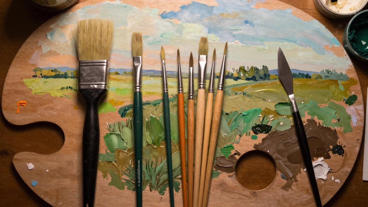
Your brush choice should change as you move from background to foreground. This physical shift reinforces the mental shift from broad concepts to specific details.
Background: Use large, flat or filbert brushes. These hold more paint and allow for smooth, sweeping strokes. For skies, a large hog bristle brush works well to lay down thin washes. Avoid stiff, round brushes here; they tend to leave scratchy marks that ruin the softness of the distance.
Mid-Ground: Switch to medium-sized brushes. Filberts are excellent here because their rounded tip allows for both broad coverage and slight shaping. You can suggest the form of trees or rocks without getting bogged down in leaves or cracks.
Foreground: Now is the time for smaller, stiffer brushes. Rounds, flats, and even palette knives come into play. You want to create texture. Dragging a dry brush over thick paint can simulate grass. Using a knife can scrape out highlights on rocks. The contrast between the smooth background and textured foreground enhances realism.
If you find yourself struggling with the transition between layers, consider using a "scumbling" technique. Apply a thin, opaque layer of lighter paint over a darker, dry underlayer. This breaks up the solidity of the dark areas and integrates them with the background, creating a cohesive whole.
Practical Tips for Better Depth
To take your landscape painting to the next level, focus on these subtle adjustments during the ordering process.
Cool Down the Distance: As you move from foreground to background, add a touch of blue or purple to your mixes. Even warm sunset skies have cooler tones near the horizon due to atmospheric scattering. This simple color shift pushes elements back visually.
Reduce Saturation: Distant objects are less colorful. Desaturate your background mixes by adding a complementary color or white. Save the vibrant greens, reds, and yellows for the foreground where the air is clearer.
Lower Contrast: The difference between light and dark is less pronounced in the distance. Keep your background values closer together. Increase the contrast as you move forward. The darkest darks and brightest lights should reside in the foreground or focal point.
For example, if you are painting a river scene, the water in the foreground might reflect the dark trees sharply, showing high contrast. The same river in the distance merges with the sky, becoming a pale, low-contrast band of color. Capturing this gradient is what makes a painting feel expansive.
Remember, practice makes permanent. Try painting the same scene twice: once following the background-first rule, and once breaking it. Compare the results. You will likely find that the structured approach yields faster progress and more convincing depth. It frees your mind to focus on color and composition rather than worrying about covering up mistakes.
Should I paint the sky first or the ground?
You should almost always paint the sky first. This establishes the lightest values and coolest colors, allowing you to layer darker, warmer elements over them as you move toward the foreground. This technique creates natural depth and prevents muddy colors in the background.
Can I paint the foreground first in acrylics?
While possible, painting the foreground first in acrylics is challenging. Acrylics dry quickly and become opaque. If you paint dark foreground elements first, you cannot easily blend them into a lighter sky later. It is better to work from light to dark, back to front, to maintain transparency and depth.
How do I keep the background soft?
Use larger brushes and thinner paint consistency for the background. Blend edges while the paint is still wet. Avoid hard lines or sharp contrasts in distant areas. You can also use a dry brush to soften edges after they have partially dried, creating a hazy, atmospheric effect.
What is atmospheric perspective?
Atmospheric perspective is the phenomenon where distant objects appear lighter, less saturated, and bluer due to particles in the air scattering light. In painting, you mimic this by making background elements cooler and lower in contrast compared to the foreground.
Is it okay to mix layers if I am using oils?
Yes, oils are ideal for wet-on-wet techniques. You can blend the sky and distant hills seamlessly because the paint stays workable for days. Just be careful not to overwork the paint, which can lead to cracking later. Stick to the "fat over lean" rule, applying thicker paint over thinner layers.
How do I avoid muddy colors in the sky?
Pre-mix your sky colors on the palette before touching the canvas. Limit the number of colors you mix for the sky-usually two or three hues plus white. Avoid mixing complements (like red and green) directly in the sky area unless you specifically want a muted, overcast look.