You can't ignore the background when you're painting a portrait. It's not just empty space. The background can completely change how the person looks and feels in your painting. If the background's too busy, nobody's looking at your subject—they're staring at the stuff behind them. If it’s too plain or clashes, the whole thing falls flat.
Picking the right background is kind of like setting the stage for your favorite actor, but here, your subject's the star. Think about this: a simple, soft color can make facial features look stronger, while an outdoor scene can add a story to your portrait. Choosing a background is all about balance—too little, and it’s dull; too much, and it’s chaos.
So what actually works best? Are neutral tones the answer? How about bold color blocks, textures, or something totally wild like graffiti walls? Spoiler: you don’t have to be fancy or traditional—there are smart ways to make any background work for you. Let’s break down the options so you never have to second guess your choices again.
- Why the Background Matters
- Classic Background Choices
- Modern and Creative Approaches
- Dos and Don’ts for Beginners
- Tips for Picking the Perfect Background
Why the Background Matters
If you ask most artists who paint people, they'll tell you the background makes or breaks a portrait. It’s not just a backdrop; it's part of the story. Sometimes, the right background can make your subject pop and add a meaning that a blank wall never could. That’s why it’s key to think about background way before you start throwing paint on the canvas.
The portrait painting background does more work than you think. Think about the famous Mona Lisa—her mysterious landscape gives her that ‘what’s she thinking?’ vibe. A background can lead your eyes right to the face, give a clue about the person’s life, or even hint at the time period. Some artists use soft, blurred backgrounds, like in many 18th-century pieces, to make their subject the dead-center of attention. Others, like Kehinde Wiley, are known for bold, patterned backgrounds that say as much as the subject’s face.
"The background is the environment of the soul, and if you miss that, you've painted a head, not a person." — Lucian Freud
Science backs this up, too. Studies in visual perception show that the background can influence how viewers feel about the subject’s mood, age, and even trustworthiness. Warm colors often make people seem friendly and inviting, while cool or dark backgrounds bring out a bit more drama or seriousness. Basically, every choice you make with the background tells your viewer how they should feel about what they’re seeing.
If you want your portraits to feel complete instead of random snapshots, pay attention to backgrounds. They can highlight personality, set the mood, and turn your painting into a real story—not just a face on a canvas.
Classic Background Choices
If you want to know what has worked for centuries in portrait painting, look at the backgrounds in museums. Artists like Leonardo da Vinci and Rembrandt almost always went for simple, calm backdrops. Why? Because the less distraction, the more your eye focuses on the person.
Neutral colors—think grays, browns, soft greens, or muted blues—are always a safe bet. These colors let details like skin tones, eyes, and clothing get all the attention. Back in the day, artists used earth tones because those pigments lasted and didn’t overshadow the subject. Even today, cream or beige backgrounds get picked often because they go with almost any skin tone and clothing.
Some artists used what’s called a “sfumato” effect—a soft, cloudy blur with no sharp edges. This makes the subject look like they’re stepping out of the shadows (the Mona Lisa is a classic example). Others liked dark, solid colors because they make lighter faces and clothes pop, which you’ll see in tons of Victorian and Baroque portraits.
Here are some classic ideas that never go out of style:
- Solid muted tones: Pale blue, olive, warm gray, or tan—good for any style and any time period.
- Subtle gradients: Fading one color softly into another pulls the focus to the face without looking boring.
- Simple draped fabric: A curtain or cloth with folds adds just enough texture, like you see in old oil paintings.
- Soft blur (sfumato): A gently blended transition from dark to light brings soft drama without stealing attention.
If in doubt, ask yourself: does the background support the person, or fight for attention? Classic backgrounds keep the spotlight right where you want it. That’s why these choices have stuck around for so long.
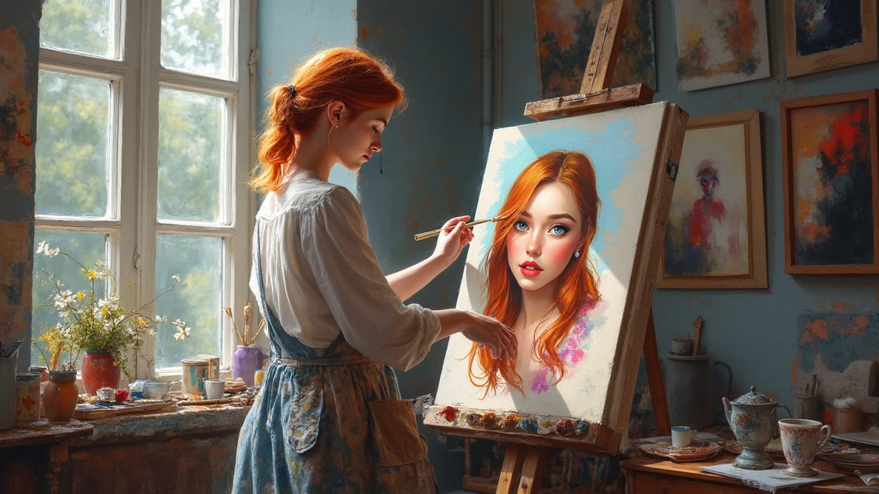
Modern and Creative Approaches
If you want your portrait painting to stand out these days, ditch the standard beige backgrounds. Artists have started using bold color pops, textured brushwork, and even digital backdrops to give their work a fresh twist. The trick is to let the background support your subject, not fight for attention.
Let’s talk bold colors. Using bright orange, electric blue, or deep green behind a sitter can make the face jump right off the canvas. A recent survey from a UK art materials retailer in 2024 found that 36% of new portrait painters used saturated colors in their backgrounds, a jump from just 20% a few years ago.
Texture is another way to shake things up. Dragging a dry brush or palette knife across the background gives a gritty look that brings energy, without overloading the scene. You can even use tissue, bubble wrap, or sponges for extra effects—just keep it subtle unless you want all the drama.
Abstract shapes or graphic elements are super hot right now, especially for younger artists. Sometimes, people paint simple geometric patterns, blur the background into a gradient, or leave big brush strokes behind the subject. Think about how artists like Kehinde Wiley use those loud, patterned backgrounds that tell a story and make each painting unforgettable.
Tech-lovers aren’t left out. Projected images, mixed-media, or even augmented reality (AR) elements are landing in portraits—especially in art schools or digital galleries. But no matter how high-tech you get, the rule is the same: if the background overpowers your subject, you’ve gone too far.
| Creative Approach | Percent of Artists (2024 Survey) | Pro Tip |
|---|---|---|
| Bold color backgrounds | 36% | Pick a color that contrasts but doesn’t clash with skin tones |
| Textured paint techniques | 22% | Test texture on a scrap piece before going on your main canvas |
| Graphic or geometric shapes | 18% | Use simple shapes so attention stays on the face |
| Digital or mixed-media | 10% | Plan colors in advance, especially when mixing digital and paint |
Don’t get boxed in by old-school rules. Experiment with your portrait painting backgrounds until something clicks. Just check that your choices lift your subject, not swallow them up. Mixing it up can sometimes lead to your best work yet.
Dos and Don’ts for Beginners
If you’re just starting with portrait painting, the background can feel like the wild west—full of options but also easy to mess up. Here are some no-nonsense dos and don’ts that’ll keep your paintings on track.
- Do keep it simple when you’re new. A busy or detailed background can make painting harder than it needs to be. Most artists recommend sticking to uncluttered backgrounds—like one or two solid colors or a soft gradient. This helps your subject take center stage.
- Don’t pick colors just because they look cool. Think about how your background color reacts with the person’s skin, hair, and clothes. For example, warm backgrounds (like soft oranges or reds) can make skin tones pop, while cool backgrounds (like blues or greens) might create a calm vibe.
- Do consider the light source. If the light in your portrait comes from the left, hint at lighter tones on that side of the background. This trick helps add depth and stops things from looking flat.
- Don’t ignore contrast. If your subject has dark hair and you use a dark background, details will disappear. Shoot for contrast—light background with dark hair or vice versa—to make sure people actually see your subject’s features.
- Do test with thumbnails. Before you hit the canvas, try out a few quick sketches or even digital mockups to see what’s working. This saves you from having to fix big mistakes later.
Here’s something cool: professional portrait artists often use backgrounds to highlight the story or feeling behind a person. But if you’re only starting out, focus on balance, simple colors, and not stealing the show from your subject. Build up your confidence and skill before you throw that fancy cityscape or abstract pattern back there. With a strong portrait painting background, you instantly level up—even on your first try.
Tips for Picking the Perfect Background
If you’re stuck staring at a blank space behind your portrait, you’re not alone. Finding the right background isn’t magic—it’s knowing a few tried and true tricks. Here’s what actually makes a background work:
- Portrait painting backgrounds should always support your subject, not overpower them. Use colors that contrast just enough to make faces or features pop. For people with dark hair or clothes, go lighter. For lighter skin or outfits, a slightly deeper or muted tone helps.
- Take a quick snapshot of your subject, and play with digital backgrounds before painting. Even professional artists do this to check if something feels off before they touch brush to canvas.
- Check your lighting. If your source of light is from one side, make sure the background follows that play of light and shadow. This keeps the portrait believable and visually interesting.
- Steer clear of busy patterns or strong shapes right behind the head—nobody wants tree branches growing out of their ear! Keep it simple behind the subject’s face and busier around the edges if you want some texture.
- Refer to classic portraits for inspiration. It’s no accident that so many famous pieces have subtle backgrounds. These let the personality do the talking.
Wondering what kind of backgrounds most portrait artists pick these days? Take a look:
| Background Type | How Often Used (2024 Survey) |
|---|---|
| Neutral Solid Color | 62% |
| Simple Gradient | 15% |
| Detailed Indoor Scene | 13% |
| Nature/Outdoor | 8% |
| Bold Patterned | 2% |
Here's what else helps:
- If you’re just starting out, solid colors or light gradients are almost always a safe bet.
- Want to add interest but not steal focus? Use soft textures or brushstrokes to hint at a setting (like a blurred-out park or window) without defining every detail.
- Test your color choices next to a sample of your subject’s skin tone or main clothing color, so you don’t end up with awkward clashing.
- Ask yourself if the background says anything about your subject—sometimes, a little context makes the portrait feel more personal.
Bottom line: there’s no single “right” background, but there are plenty of smart choices that will make your portraits stand out—without competing with the person you've worked so hard to paint.