Abstract Art Decoder & Experience Tool
Your Interpretation
Describe what you feel, not what you see.
Interpretation Guide
Note: There is no wrong answer. If you feel nothing, that is also a valid artistic experience.
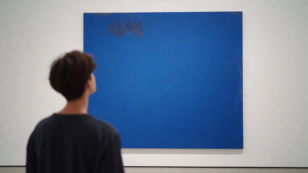
You’re standing in front of a canvas. It’s blue. Just blue. Maybe there’s a scratch in the corner or a slightly darker patch near the top. You squint. You tilt your head. Then, the inevitable question hits you: What does it mean?
If you’ve ever walked out of a gallery feeling like you missed the joke, you’re not alone. The idea that abstract art must carry a hidden message is one of the biggest barriers people face when trying to engage with it. We are trained from childhood to look for pictures of things-a horse, a house, a person. When we don’t see them, we panic. But here is the controversial truth: abstract art often doesn't have to mean anything at all.
The Myth of the Hidden Message
Most people approach abstract art like a puzzle. They assume there is a correct answer, a secret code left by the artist that, once cracked, unlocks the value of the piece. This mindset comes from our history with representational art. For centuries, paintings were functional records. They told stories, documented events, or displayed religious figures. If you painted a king, he needed to look like the king. Meaning was tied to recognition.
But in the early 20th century, artists started asking a different question: Why do we need to paint objects at all? What if color and shape could speak directly to us without needing a subject? This shift wasn’t just rebellion; it was an exploration of human perception. Artists realized that certain colors evoke specific feelings regardless of what they depict. Red feels urgent. Blue feels calm. A sharp diagonal line feels dynamic, while a horizontal one feels stable. These reactions are biological, not intellectual. You don’t need to know the artist’s biography to feel the tension in a jagged red stroke.
When you demand that a painting "mean" something in terms of a narrative or symbol, you might actually be blocking your ability to experience it. Think about music. Does a symphony by Beethoven have to "mean" something specific? Or can it just make you feel triumphant, sad, or energized? Abstract art works similarly. It aims to bypass the logical brain and hit the emotional center directly. Demanding a literal translation is like asking a song to explain its lyrics when it’s purely instrumental.
Two Types of Abstraction: Emotional vs. Formal
To understand why some abstract art seems meaningless while other pieces feel profound, it helps to split abstraction into two main camps. Not every abstract painter is doing the same thing.
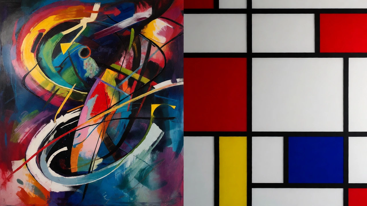
Expressionist Abstraction is a style where the artist uses non-representational forms to convey internal emotions, spiritual states, or subconscious thoughts. Here, the "meaning" is subjective and deeply personal to the creator. Wassily Kandinsky, often credited as the father of pure abstraction, believed that colors had sounds and shapes had spiritual vibrations. He didn’t paint a tree; he painted the *feeling* of being alive in nature. In this context, the art does have meaning, but it’s not a dictionary definition. It’s an emotional resonance.
On the other side, you have Formalist Abstraction, which focuses on the physical properties of the artwork itself-color, line, shape, and texture-rather than any external reference. Piet Mondrian is the classic example. His grids of black lines and primary colors weren’t trying to tell a story about trees or cities. He was exploring balance, harmony, and the fundamental structure of reality. For Mondrian, the meaning was in the composition itself. The painting didn’t refer to anything outside the frame. It simply existed as a perfect arrangement of visual elements.
Knowing which camp you’re looking at changes how you should interpret the work. If you’re staring at a Jackson Pollock drip painting (Expressionist), you’re looking at energy and movement. If you’re looking at a Mark Rothko color field (which sits somewhere in between), you’re looking for immersion and mood. If you’re looking at a Bridget Riley op-art piece (Formalist), you’re experiencing optical effects. Asking "what is this picture of?" is the wrong question for both, but for different reasons.
The Artist’s Intent vs. Your Experience
There is a famous debate in art theory called the "Intentional Fallacy." It argues that the artist’s intended meaning doesn’t matter once the work is finished. Once the paint dries, the art belongs to the viewer. This is liberating. It means you don’t need a degree in art history to enjoy a piece. If a chaotic splash of yellow makes you feel happy, then the painting means happiness to you. That is a valid meaning.
Consider the case of Barnett Newman. He painted large canvases divided by single vertical lines, which he called "zips." Critics mocked him, saying his work looked like wallpaper. Newman argued that these zips created a sense of presence and scale. He wanted viewers to stand close and feel small. Did it work? For many, yes. For others, no. Neither group is wrong. The meaning isn’t fixed in the paint; it’s created in the interaction between the eye and the surface.
This is where the concept of "non-representational art" becomes crucial. Unlike abstract art, which often starts with a real object and distorts it, non-representational art has no starting point in the visible world. Kazimir Malevich’s Black Square is the ultimate example. It is literally nothing but a black square on white. There is no hidden image. No symbolism. Malevich called it the "zero point of painting." Its meaning is philosophical: it strips away all distraction to focus on pure feeling. If you try to find a picture inside it, you will fail. If you let it sit in your vision, you might feel a strange silence or emptiness. That feeling is the meaning.
Why We Crave Meaning (And Why It’s Okay to Let Go)
Humans are pattern-seeking machines. Our brains evolved to spot predators in the grass, so we are wired to find shapes and stories everywhere. This is called pareidolia-the tendency to see faces in clouds or cars. When we look at abstract art, our brains desperately try to force patterns onto random splashes. We think, "That looks like a dog," or "That reminds me of a storm."
This isn’t bad. In fact, it’s part of the fun. Interpretation is active participation. When you project your own memories or associations onto a blank space, you are co-creating the artwork. However, problems arise when we believe there is only one correct interpretation. Gallery labels often exacerbate this by providing dense, academic explanations that imply a single "right" way to see the piece. They turn viewing into homework.
Try this experiment next time you visit a gallery. Stand in front of an abstract piece for ten seconds. Don’t look for objects. Don’t read the label. Just notice how your body reacts. Do you feel tense? Relaxed? Confused? Bored? Write down those three words. That is your meaning. It might change tomorrow. It might differ from your friend’s reaction. And that variability is exactly what makes art alive.
| Aspect | Expressionist Abstraction | Formalist Abstraction |
|---|---|---|
| Primary Goal | Convey emotion/spirituality | Explore visual structure/balance |
| Key Artist Example | Wassily Kandinsky | Piet Mondrian |
| Viewer's Task | Feel the energy/mood | Analyze composition/color relationships |
| Relation to Reality | Indirect (emotional echo) | None (pure form) |
| Common Reaction | "This feels intense/calm" | "This looks orderly/chaotic" |
Practical Tips for Viewing Abstract Art
If you want to stop feeling frustrated by abstract pieces, you need to change your strategy. You aren’t failing to decode a message; you’re using the wrong tool for the job. Here is how to adjust your approach:
- Stand closer, then further back. Up close, you see the texture, the brushstrokes, and the physical effort of the artist. Step back, and you see the overall composition. Both views offer different information.
- Ignore the title initially. Titles can bias your perception. If a painting is called "Grief," you will look for sadness. Try looking at it before reading the sign. See what you naturally perceive.
- Focus on color temperature. Is the palette warm (reds, oranges) or cool (blues, greens)? Warm colors tend to advance visually and feel energetic; cool colors recede and feel calming. Notice how this affects your breathing or posture.
- Accept ambiguity. It is okay to say, "I don't know." Ambiguity is a feature, not a bug. It allows the work to remain open to multiple interpretations over time.
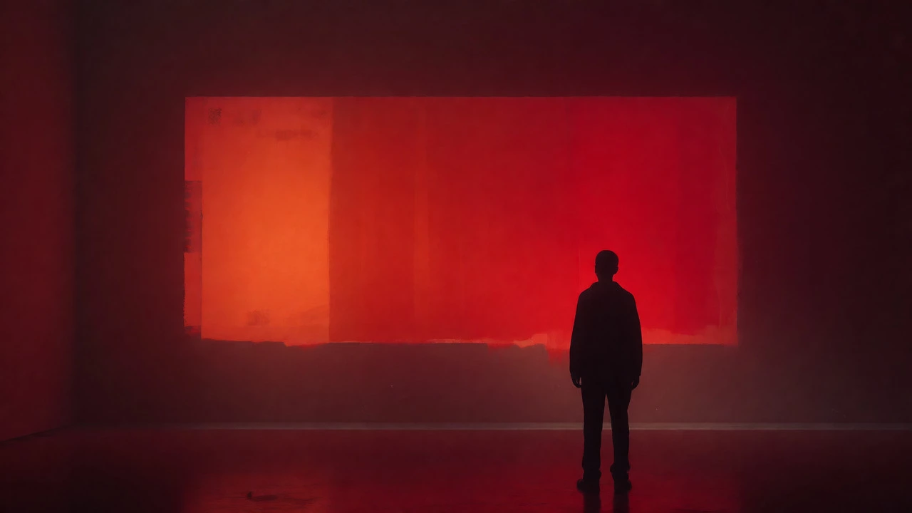
Remember, art isn’t always about communication. Sometimes it’s about presence. A Rothko painting doesn’t talk to you; it surrounds you. It creates a space for contemplation. If you leave a gallery feeling nothing, that’s fine too. Not every piece needs to resonate with every person. The goal isn’t to understand everything; it’s to expand your capacity to feel and observe.
Frequently Asked Questions
Is abstract art just random?
No, rarely. Even when it looks spontaneous, like Jackson Pollock's drips, it involves careful control, rhythm, and layering. Artists make deliberate choices about color balance, density, and movement. Randomness might be a tool, but the final composition is curated.
How do I know if I'm 'getting' abstract art?
If you are having an emotional or sensory reaction, you are getting it. There is no pass/fail test. If a painting makes you curious, uncomfortable, or calm, you are engaging with it correctly. Intellectual understanding is secondary to experiential response.
Why do critics love abstract art?
Critics appreciate abstract art because it pushes the boundaries of what painting can do. It explores pure aesthetics, challenges traditional skills, and reflects modern philosophical ideas about subjectivity and perception. It frees art from the obligation to copy reality.
Can abstract art be bad?
Yes. Bad abstract art can be derivative, poorly composed, or lack intentionality. Just because it doesn't depict a object doesn't mean technical skill or compositional balance doesn't matter. A muddy, unbalanced mess is still a mess, even if it's abstract.
What is the difference between abstract and non-representational?
Abstract art usually derives from a real-world source (like a flower or landscape) but simplifies or distorts it. Non-representational art has no reference to the visible world at all; it exists purely as shapes and colors. All non-representational art is abstract, but not all abstract art is non-representational.