Interactive Principles of Art Visualizer
Select a Principle
-
Balance
Distribution of visual weight -
Rhythm
Repetition creating movement -
Unity
Cohesiveness of elements -
Emphasis
Focal point creation -
Movement
Path for the eye to follow -
Proportion
Relative size relationships -
Scale
Size relative to environment -
Variety
Diversity creating interest
Balance
Symmetrical balance creates stability through mirrored elements. The visual weight is evenly distributed across the central axis.
Ever looked at a painting that just felt... off? You can't quite put your finger on it, but something is missing. It’s not necessarily that the drawing skills are bad or the colors are wrong. Often, the issue lies in how those pieces fit together. That’s where the principles of art come into play.
While the elements of art (like line, shape, and color) are the building blocks you use to create, the principles are the rules you follow to arrange them effectively. Think of it like cooking: the elements are your ingredients-flour, sugar, eggs. The principles are the recipe-the method that turns those raw materials into a cake instead of a mess. Understanding these eight core concepts helps you move from making things that look "nice" to creating work that communicates clearly and powerfully.
Balancing Your Composition
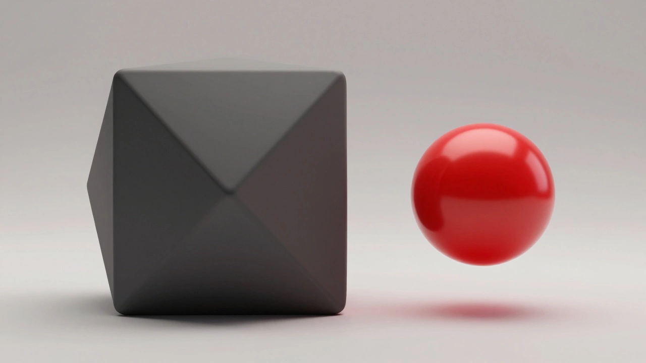
Balance is the distribution of visual weight in an artwork. If one side of your canvas feels heavy with dark colors or large shapes, while the other side is light and empty, the viewer’s eye will feel pulled awkwardly. Balance doesn’t always mean symmetry. In fact, symmetrical balance can sometimes feel static or boring, like a mirror image.
Many artists prefer asymmetrical balance. This happens when different objects have equal visual weight. For example, a small, bright red dot on one side can balance out a large, pale grey shape on the other. The intensity of the red gives it enough "pull" to counteract the size of the grey. When you’re sketching, step back and squint your eyes. Does the composition feel stable, or does it tip over to one side?
- Symmetrical: Identical halves mirrored across a central axis.
- Asymmetrical: Different elements balanced by contrast in color, texture, or size.
- Radial: Elements radiating outward from a central point, like spokes on a wheel.
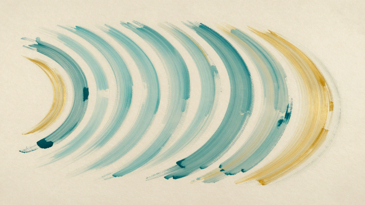
Creating Flow with Rhythm
If balance keeps your art from tipping over, Rhythm is the repetition of elements to create a sense of movement. Just like music has a beat, visual art has a pattern that guides the eye through the piece. Without rhythm, a composition can feel disjointed, as if every element is shouting for attention individually rather than working together.
You create rhythm by repeating lines, shapes, or colors. But here’s the trick: don’t just repeat them exactly. Introduce slight variations to keep the viewer interested. This is often called progressive rhythm, where a shape changes gradually in size or color as it moves across the page. Think of footprints leading away into the distance-they establish a path for the eye to follow. In a busy scene, rhythm helps organize chaos, giving the viewer a predictable yet engaging journey through your work.
Finding Unity and Variety
Unity is the feeling of wholeness or completeness in an artwork. When all the parts of a piece seem to belong together, you’ve achieved unity. It’s the opposite of variety, which introduces difference. The best artworks usually strike a balance between the two. Too much unity, and the work becomes monotonous; too much variety, and it becomes chaotic.
How do you achieve unity? One common technique is proximity. Placing elements close together suggests they are related. Another is using a consistent color palette. If you use only blues and greys throughout a landscape, even if the shapes are different, the eye perceives them as part of the same family. Unity answers the question: "Does this look like one cohesive idea, or did five different people paint five different sections?"
| Concept | Effect on Viewer | How to Achieve It |
|---|---|---|
| Unity | Creates harmony and calm | Use similar colors, repeated shapes, or consistent textures |
| Variety | Creates interest and excitement | Introduce contrasting colors, irregular shapes, or mixed media |
Drawing Attention with Emphasis
In any good story, there’s a climax. In art, that’s Emphasis, also known as focal point. It’s the area of the artwork that catches the viewer’s eye first. Without emphasis, a viewer might scan your entire piece without ever knowing what to focus on. They’ll bounce around aimlessly until they give up.
You can create emphasis in several ways. Contrast is the most powerful tool. If your background is soft and muted, a sharp, bright object will pop right out. Size also matters-larger objects naturally draw more attention. Isolation works too; placing a single object in an empty space makes it stand out because there’s nothing else competing for attention. Ask yourself: "What is the main message of this piece?" Then, make sure everything else supports that message rather than distracting from it.
Guiding the Eye with Movement
Don’t confuse movement with motion. Movement is the path the viewer's eye takes through the artwork. While rhythm repeats elements, movement connects them. It’s about how you lead the viewer from the focal point to secondary details, and then perhaps back again.
Artists use implied lines to create this flow. A character’s gaze, a pointing finger, or the direction of brushstrokes can all act as arrows directing the eye. If you want the viewer to notice a subtle detail in the corner of the painting, you need a visual bridge-a line of sight or a trail of light-that leads them there. Good movement ensures the viewer spends time exploring the whole piece, not just staring at one spot.
Getting the Scale Right with Proportion
Proportion refers to the relative size of parts within a whole. This isn’t just about realism. Even in abstract art, proportions matter. If you’re painting a portrait, and the eyes are twice the size of the head, you’ve intentionally distorted the proportion for effect. But if you’re aiming for realism, accurate proportion is crucial.
Proportion also relates to scale-the size of the object compared to its surroundings. A tiny figure standing next to a massive mountain conveys a sense of awe and isolation. Getting proportions wrong can break the illusion of depth. In perspective drawing, objects further away should be smaller. Ignoring this rule flattens the image, making it look like a collage rather than a window into another world.
Bringing It All Together
These eight principles don’t exist in isolation. They overlap and interact constantly. Balance affects rhythm. Emphasis influences movement. Unity relies on proportion. When you start critiquing your own work, try looking at it through each lens separately. First, check the balance. Then, trace the movement. Finally, ask if the unity holds up.
Mastering these principles takes practice. You won’t get it right every time, and that’s okay. Many great artists spend years refining their understanding of these basic rules. The goal isn’t to follow them rigidly like a checklist, but to understand them well enough to break them intentionally when it serves your artistic vision.
What is the difference between elements and principles of art?
Elements are the basic components used to create art, such as line, shape, color, and texture. Principles are the guidelines for arranging those elements, such as balance, rhythm, and emphasis. Think of elements as ingredients and principles as the recipe.
Why is emphasis important in art?
Emphasis creates a focal point, guiding the viewer's eye to the most important part of the artwork. Without emphasis, the viewer may feel confused or overwhelmed, unable to determine what the artist wants them to focus on first.
How can I improve the balance in my drawings?
Step back from your work and squint your eyes to see the overall value structure. If one side feels heavier, add darker values or larger shapes to the lighter side. Alternatively, remove some visual weight from the heavier side. Experiment with asymmetrical balance for more dynamic compositions.
Is symmetry always better than asymmetry?
Not necessarily. Symmetry creates a sense of stability and formality, which is great for logos or religious icons. However, asymmetry is often more interesting and natural, mimicking the unpredictability of real life. Most contemporary art favors asymmetrical balance for its dynamism.
Can I break the principles of art?
Yes, absolutely. Once you understand the principles, you can break them intentionally to create specific effects, such as tension, chaos, or surprise. However, breaking rules without understanding them usually results in a confusing or unappealing composition.
