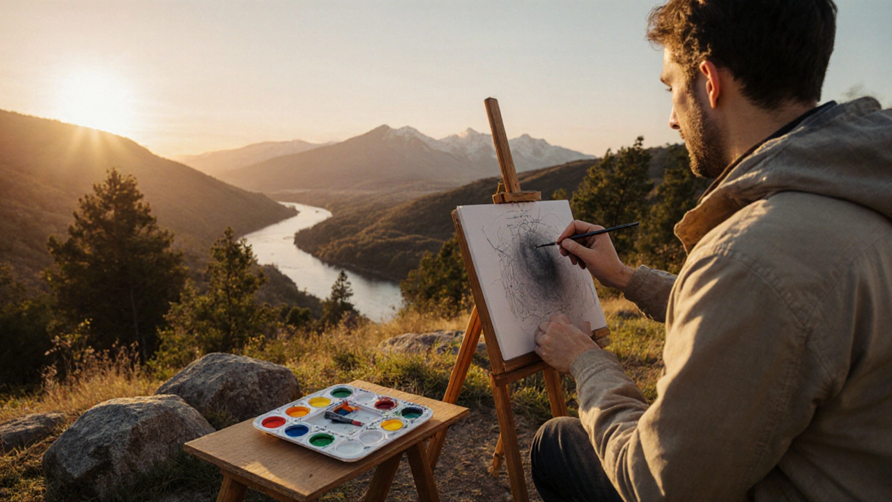
Landscape Painting Rules: Essential Guidelines for Artists
12 Oct 2025Learn the essential rules for landscape painting, from composition and color palette to perspective, lighting, brushwork, and choosing the right medium.
Continue reading...Ever wonder why some paintings grab your attention instantly while others feel flat? The secret usually lies in composition – the way you place shapes, colors, and lines on the canvas. Good composition doesn’t need fancy jargon; it’s about clear choices that lead the viewer’s eye where you want it to go. Below are practical ideas you can start using today.
Think of a composition like a road map for the eye. When you arrange elements thoughtfully, the viewer moves through the piece naturally, noticing the main subject first, then the supporting details. Bad composition feels chaotic, making the eye jump around aimlessly. This can dilute the message of your artwork and leave people confused about what you’re trying to say.
Artists across history – from Da Vinci to modern street creators – use the same basic rules, just with different styles. The goal is always the same: keep the viewer engaged and make the story of the piece easy to read.
1. Rule of Thirds. Imagine your canvas divided into a 3x3 grid. Place key elements along the lines or at the intersections. This simple trick adds tension and interest without feeling forced.
2. Lead‑in Lines. Use natural lines – a road, a river, a beam of light – to point toward the main subject. Your eye will follow those lines like a trail, making the focal point feel inevitable.
3. Balance. Balance isn’t always symmetrical. You can place a large dark shape on one side and several smaller light shapes on the opposite side to keep the visual weight even.
4. Contrast. Mix bright with muted, rough with smooth, or sharp with soft. Contrast creates focal points and helps separate different parts of the picture.
5. Framing. Use elements like arches, windows, or even hands to frame the subject. This draws attention inward and adds depth.
Try combining two or three of these tricks in one piece. You’ll see the composition become more dynamic and the story clearer.
Remember, composition is a habit, not a rulebook. Play around, step back, and ask yourself: “What’s the first thing I see? Does my eye travel where I want it to?” If the answer isn’t clear, tweak the placement until it feels right.
Feeling inspired? Check out our posts on “Best Colours for Landscape Painting” and “Abstract Painting: How to Begin Without Fearing the Blank Canvas” for more ideas on how colour and style work together with composition. With a few simple adjustments, your art can go from decent to unforgettable.
Learn the essential rules for landscape painting, from composition and color palette to perspective, lighting, brushwork, and choosing the right medium.
Continue reading...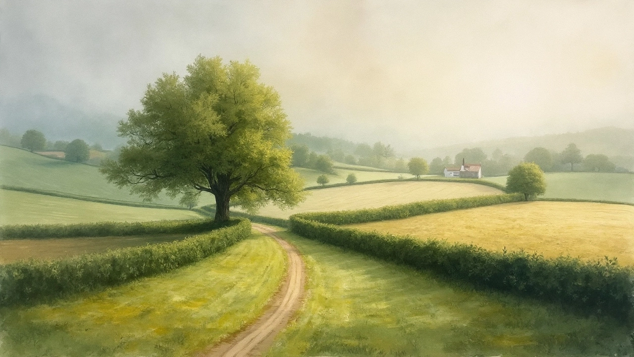
Discover how the rule of thirds shapes stunning landscape paintings, with practical tips, artist secrets, and visual examples for balanced, eye-catching art.
Continue reading...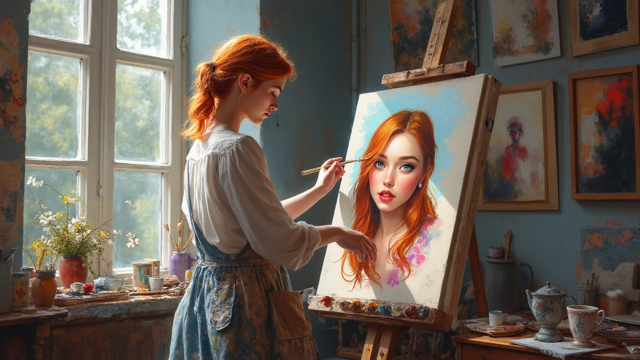
Ever wondered what your portrait's background should look like? This article cuts out the guesswork and breaks down what makes a background truly work for portrait painting. You'll find real examples, quick tips, and some creative ways to make your subject pop without overwhelming the canvas. Get ready to transform your portraits from standard to standout. No jargon, just practical ideas you can use today.
Continue reading...