Landscape Color Palette Generator
Landscape painting is a genre of art that captures natural scenery such as mountains, valleys, trees, rivers, and sky. It’s the perfect playground for anyone who loves working outdoors and wants to translate the beauty of nature onto canvas. Below you’ll find the main landscape painting rules that turn a random brushstroke into a compelling scene.
Quick Takeaways
- Start with a clear focal point and balance it using the rule of thirds.
- Choose a limited color palette that reflects the mood of the scene.
- Use linear and atmospheric perspective to create depth.
- Observe how light changes color and shape throughout the day.
- Pick a medium that matches your style and work environment.
Understanding Composition in Landscape Painting
Composition is the arrangement of visual elements within the frame. A strong composition guides the viewer’s eye and makes the scene feel organized, even when nature looks wild.
- Rule of thirds: imagine a 3×3 grid and place key elements-like a tree or a winding path-along the lines or at the intersections.
- Leading lines: rivers, roads, or rows of trees naturally draw attention toward the focal point.
- Balance: pair a large element on one side with several smaller ones on the opposite side to avoid a lopsided feel.
Before you even mix paint, sketch a quick layout using light charcoal or a pencil. This low‑stakes sketch helps you test different focal points without committing.
Choosing the Right Color Palette
Color palette refers to the specific set of colors you decide to work with for a painting. A well‑chosen palette creates harmony and conveys mood.
- Limit yourself to 5-7 hues to keep the scene cohesive.
- Use warm colors (reds, oranges) for sunlight‑lit areas and cool colors (blues, violets) for shadows.
- Consider a limited “analogous” scheme for calm mornings or a complementary scheme for dramatic sunsets.
Try mixing a small test swatch of each color on a spare piece of canvas. This quick test shows how the pigments interact under the same lighting conditions you’ll be painting in.
Perspective: Giving Your Landscape Depth
Perspective is the technique that creates the illusion of three‑dimensional space on a flat surface. Two main types matter for landscapes:
- Linear perspective: converging lines, like a road or fence, meet at a vanishing point on the horizon.
- Atmospheric (or aerial) perspective: colors become lighter, cooler, and less detailed with distance.
Start by establishing a horizon line and one or two vanishing points. Then, gradually soften the colors and reduce detail as you move toward the background.
Lighting and Atmospheric Effects
Lighting dictates the shape, color, and mood of every element in a landscape. Pay attention to the quality of light-soft and diffused on overcast days, sharp and contrasting at golden hour.
- Observe how shadows shift in hue; they’re rarely pure black.
- Capture the glow of reflected light on water or wet rocks.
- Use thin glazes to build up atmospheric haze in distant mountains.
When painting en plein air, note the time of day, cloud cover, and temperature. These factors influence how colors appear on the canvas.
Brushwork and Texture
Brushwork is the way you apply paint with brushes or other tools. Different strokes suggest various textures-soft foliage, rough bark, smooth water.
- Use a flat brush for broad sky washes.
- Fan brushes create delicate foliage textures.
- Palette knives can add impasto highlights on rocks or tree trunks.
Experiment on a scrap canvas before committing to the final piece. The right brush, pressure, and angle can make a huge difference.
Selecting the Appropriate Medium
Medium refers to the material you paint with, such as oil, acrylic, or watercolour. Each medium has its own workflow, drying time, and color characteristics.
| Medium | Drying Time | Typical Use | Pros | Cons |
|---|---|---|---|---|
| Oil | Days to weeks | Rich, layered vistas | Blendable, luminous colors | Slow drying, requires solvents |
| Acrylic | Minutes to hours | Fast‑paced outdoor sessions | Water‑soluble, easy cleanup | Colors can darken as they dry |
| Watercolour | Instant | Delicate, atmospheric scenes | Transparent washes, portable | Less forgiving, limited texture |
Choose oil if you enjoy slow, contemplative work and want deep, saturated tones. Opt for acrylic when you need speed and easy transport. Watercolour shines for spontaneous sketches of misty mornings.
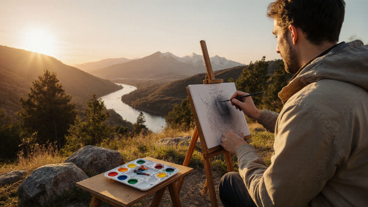
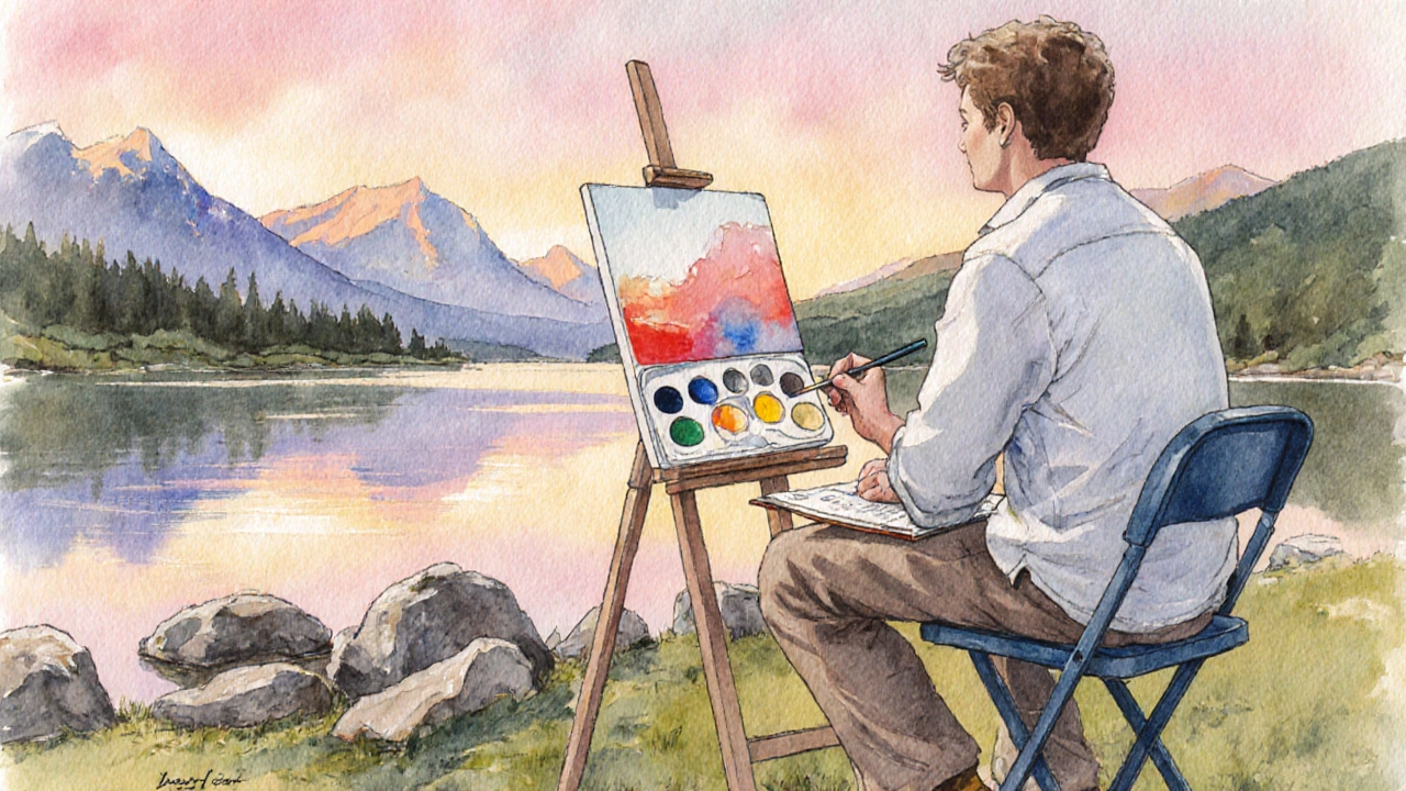
Practical Tips for Working Outdoors (Plein Air)
Foreground is the part of the landscape closest to the viewer. It often contains the most detail and helps anchor the composition.
- Set up a portable easel and a small sketchbook for quick studies.
- Use a limited palette to keep your bag light.
- Draft a quick underpainting in muted tones; it serves as a value map.
- Keep a set of reference photos for moments when the light changes.
Don’t be afraid to work in layers. Start with broad shapes, then add details as the light stabilizes. Remember, the goal is to capture the feeling of the place, not a photographic replica.
Checklist: Do‑and‑Don’t for Landscape Painting
- Do scout the location beforehand to understand composition opportunities.
- Do carry a small palette and a few essential brushes.
- Do sketch the horizon and major lines before adding color.
- Don’t over‑mix colors on the canvas; keep a clean mixing area.
- Don’t ignore the sky; it often sets the tonal balance for the whole painting.
Frequently Asked Questions
What is the best time of day for plein air landscape painting?
Early morning and late afternoon, known as the golden hours, provide soft, warm light that enhances color depth and creates long shadows, making it easier to capture atmospheric mood.
How many colors should I include in my palette?
Aim for 5-7 core hues. You can create a wide range of values and temperature by mixing these base colors, which also keeps your palette portable.
Should I paint the sky before the ground?
Most artists start with the sky because it establishes the overall value and color temperature. A well‑painted sky helps you judge the reflected light on water, rocks, and foliage later.
What brush shape works best for trees?
A flat or filbert brush loaded with a small amount of paint creates the characteristic foliage strokes. For finer leaves, a fan brush can add texture without overworking the paint.
Is it okay to use a photo as a reference?
Absolutely. A photo helps you capture details you might miss in the moment, but try to interpret rather than copy it. Let the colors and mood guide your brush, not the exact pixel values.
