Art Print Resolution & Size Calculator
Input Parameters
Enter your digital file's pixel dimensions to determine optimal print sizes.
Results
Enter your pixel dimensions above to see results.
So you’ve finished a piece of work that makes your heart sing. It sits on your wall or glows on your screen, and you know it’s good. But now comes the tricky part: how do you take that singular moment and turn it into something tangible, something people can hold, frame, and live with? You want to turn your art into prints, but the world of reproduction can feel like a maze of technical jargon and hidden costs.
I get it. I’ve been there, staring at my own canvas in Bristol, wondering if the printer would capture the depth of those shadows or just wash them out into grey mush. The gap between "I made this" and "Here is a high-quality copy of this" is wider than you’d think. But once you understand the mechanics, it becomes less about guessing and more about making informed choices. Let’s walk through exactly how to bridge that gap without losing your soul-or your money-in the process.
Capturing the Source: Photography vs. Scanning
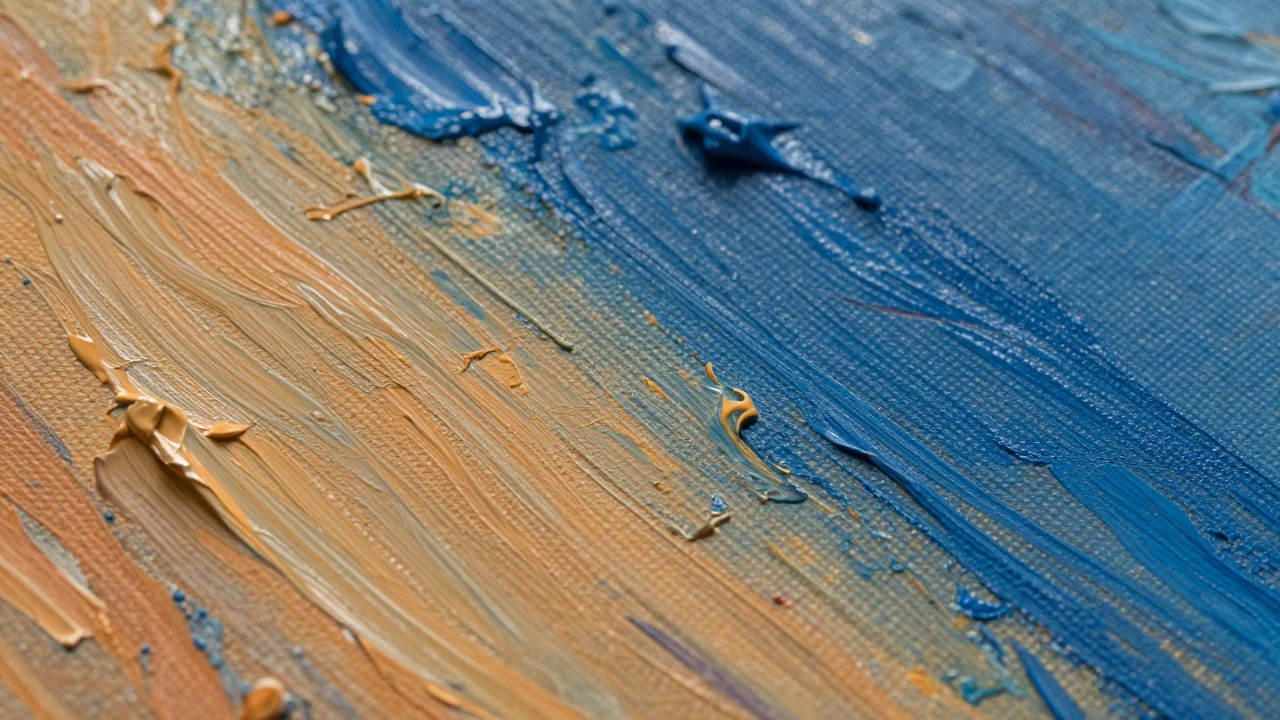
Before you worry about ink and paper, you need to worry about the digital file. If your original is physical-oil on canvas, watercolor on paper, or a charcoal sketch-you cannot simply snap a photo with your phone and expect magic. Phones compress images aggressively, killing the detail you worked so hard to create. You need a high-resolution master file.
For flat works like drawings or paintings, scanning is usually the gold standard. You’ll want a scanner that offers at least 600 DPI (dots per inch). This ensures that when the image is blown up to poster size, it doesn’t look pixelated or blurry. If you don’t have a large-format scanner, many professional labs offer scanning services. They use planetary scanners that hover over the artwork without touching it, preserving the texture of the brushstrokes.
If scanning isn’t an option, photography is your backup plan. Here’s where most artists trip up. Never use flash. Flash creates specular highlights-those ugly white reflections-that flatten the texture of your paint. Instead, set up two soft light sources at 45-degree angles to your artwork. Use a tripod to keep your camera steady, and shoot in RAW format. RAW files retain all the data from your sensor, giving you maximum flexibility when you edit later. Think of it as developing film; JPEGs are the developed snapshot, while RAW is the negative.
Choosing Your Printing Method: Giclée vs. Dye-Sublimation
Once you have your file, you need to decide how it gets onto paper. Not all printers are created equal, and the method you choose dictates the longevity and quality of your final product. For fine art, the industry standard is Giclée printing, which is a high-end digital printing process using archival pigment inks.
Giclée printers spray microscopic droplets of pigment-based ink onto paper. Unlike dye-based inks found in home printers, pigments sit on top of the paper fibers rather than soaking in. This means they resist fading significantly better. A properly printed Giclée can last over 100 years without noticeable color shift if kept out of direct sunlight. Dye-sublimation is another option, often used for photographic prints, where heat transfers dye onto a special coated paper. It produces vibrant colors but generally lacks the textural nuance and archival stability of Giclée for fine art applications.
When shopping for a printer, ask them specifically if they use pigment inks and what brand of printer they employ. Epson and Canon are the heavyweights here, with models like the Epson SureColor P-series being the benchmark for professional studios. If a printer won’t tell you what they use, run. You deserve transparency.
The Canvas of Choice: Paper Matters More Than You Think
You could have the best file and the best printer, but if you print on cheap office paper, your art will look cheap. Paper choice is not just a logistical decision; it’s an artistic one. The texture, weight, and finish of the paper change how the viewer perceives your work.
Start by considering the weight. Measured in GSM (grams per square meter), heavier papers feel more substantial. For fine art prints, aim for anything between 200gsm and 300gsm. Below 200gsm, the paper feels flimsy and might curl when framed. Above 300gsm, you’re entering heavyweight territory, which is great for texture but can be harder to mount.
Next, look at the surface. Glossy paper reflects light, making colors pop but also creating glare that fights with ambient lighting in a room. Matte or satin finishes are generally preferred for fine art because they reduce glare and mimic the look of traditional media. If you’re printing a painting, a cotton rag paper with a slight tooth (texture) can actually enhance the illusion of brushstrokes. Brands like Hahnemühle, Moab, and Ilford are staples in the studio. Don’t be afraid to order sample packs. Holding a sheet of Arches Cotton Rag in your hand tells you more than any specification sheet ever could.
Color Management: Bridging the Screen and the Wall
This is the biggest hurdle for digital artists and photographers alike. Your screen lies to you. Most monitors display colors in the sRGB gamut, which is relatively narrow. Professional printers, however, operate in a much wider color space, often Adobe RGB or even wider depending on the ink set. If you send a file calibrated for sRGB to a printer expecting Adobe RGB, your vibrant blues might turn muddy, and your deep blacks might lose detail.
To fix this, you need to calibrate your monitor. A hardware calibrator like a X-Rite i1Display or Datacolor Spyder connects to your computer and adjusts your screen’s output to match a known standard. Do this every few months. Dust accumulates on screens, and backlighting shifts over time.
Once your screen is accurate, you need a profile for your specific printer-paper combination. This is called a ICC profile. Reputable print labs provide these profiles for download. You embed this profile into your image file during export. This tells the printer exactly how to interpret the color data for that specific paper. Without it, you’re relying on guesswork. And in art, guesswork is expensive.
Proofing and Scaling: Trust but Verify
Never go straight to the final large print. Always start with a proof. Print a small version at 100% scale (or close to it) on the same paper you plan to use for the final piece. Check the contrast. Are the shadows crushed? Are the highlights blown out? Look at the details. Can you see the individual grains of sand in your seascape?
Scaling is another trap. Just because you can stretch a 300 DPI image to 24x36 inches doesn’t mean it should be. As you enlarge an image, the pixels become visible. A general rule of thumb is that you need 300 DPI at the final print size for sharpness. If your source image is only 1800 pixels wide, your maximum print width at 300 DPI is 6 inches. Going beyond that requires upscaling software, which uses AI to predict missing pixels. Tools like Topaz Gigapixel AI have gotten remarkably good at this, but they can introduce artifacts if pushed too far. Test small before committing to a large format.
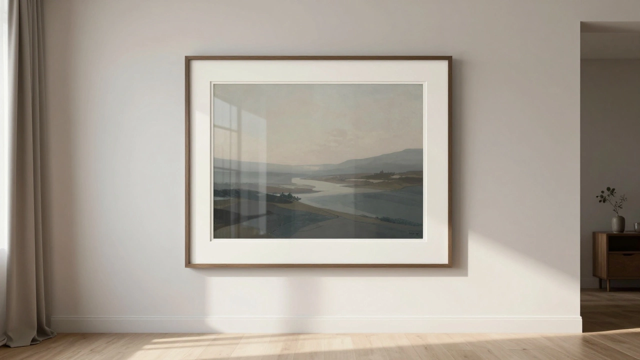
Framing and Presentation: The Final Touch
Your print is ready. Now it needs a home. Framing isn’t just decoration; it’s protection. UV-filtering glass is non-negotiable if the piece will hang near a window. Standard glass lets in ultraviolet rays that fade ink and yellow paper over time. Acrylic alternatives like Optium Museum Acrylic are lighter and shatterproof, offering excellent clarity and UV protection.
Consider the matting. A mat board creates a visual buffer between the image and the frame, drawing the eye inward. Choose a neutral tone that complements your artwork without competing with it. Acid-free mats are essential to prevent chemical reactions that can damage your print over decades. Finally, secure the print with archival tape or corners, never glue. Glue is permanent and destructive; archival methods allow for future conservation if needed.
What is the difference between Giclée and standard digital printing?
Giclée printing uses archival pigment inks sprayed in microscopic droplets, resulting in higher resolution, wider color gamut, and longer lifespan (often 100+ years). Standard digital printing typically uses dye-based inks that soak into the paper, leading to faster fading and lower color accuracy.
Do I need to calibrate my monitor before sending files to a printer?
Yes, absolutely. Uncalibrated monitors display colors inaccurately, leading to mismatched expectations between what you see on screen and what comes out of the printer. Calibration ensures your digital file represents true color values.
What DPI should I use for art prints?
Aim for 300 DPI at the final print size for optimal sharpness. If your source image is smaller, you may need to upscale using specialized software, but always test with a small proof first to check for pixelation.
Is glossy or matte paper better for art prints?
Matte or satin finishes are generally preferred for fine art as they reduce glare and mimic traditional media textures. Glossy paper enhances color vibrancy but can create distracting reflections in lit rooms.
How long do Giclée prints last?
With proper framing using UV-protective glass and storage away from direct sunlight, Giclée prints can remain stable for over 100 years without significant fading or color shift.
