Painting Medium Selector & Guide
Not sure which medium to use for your photo? Select the "vibe" or goal of your painting below to get a recommendation and a customized starting tip.
Medium Name
Artist's Strategy:
Strategy goes here...
Ever looked at a stunning vacation photo and thought, "This would look incredible as a piece of art on my wall"? You aren't alone. Most photos capture a moment, but a painting captures a mood. The secret is that you don't just copy the pixels; you interpret the light and the feeling of the place. Whether you're picking up a physical brush for the first time or using a tablet, the process is about simplifying the chaos of reality into something a bit more poetic.
Key Takeaways for Your Artistic Journey
- Focus on shapes and values rather than fine details.
- Use a limited color palette to create a cohesive mood.
- Don't be afraid to move objects or change the sky to improve the composition.
- Layer your work from the background forward.
- Experiment with different mediums based on the "vibe" of your photo.
Planning Your Masterpiece: Composition and Value
Before you touch any paint, you need to realize that a photo is often too detailed. If you try to paint every single leaf on a tree, your painting will look stiff and unnatural. This is where Composition is the arrangement of visual elements in a work of art comes in. You want to guide the viewer's eye through the scene.
Start by squinting at your photo. When you squint, the tiny details disappear, and you only see the big blocks of light and dark. These are your "values." In a professional landscape, you'll usually see three main zones: the foreground (darkest and most detailed), the midground, and the background (lightest and most hazy). This creates a sense of depth, often referred to as atmospheric perspective. If your photo has a distracting telephone pole or a random car in the frame, just leave it out. You're the artist; you're in charge of what stays.
Choosing Your Medium: Digital vs. Traditional
Depending on the result you want, you'll need different tools. Some people want the tactile feel of paint on canvas, while others want the flexibility of an "undo" button. Here is how the most popular options stack up:
| Medium | Best For | Learning Curve | Key Attribute |
|---|---|---|---|
| Acrylic Paint | Bold colors, fast drying | Moderate | Opaque layering |
| Oil Paint | Rich blends, classic look | High | Slow drying time |
| Digital Art | Experimentation, speed | Low to Moderate | Non-destructive editing |
| Watercolor | Ethereal, soft landscapes | High | Transparency |
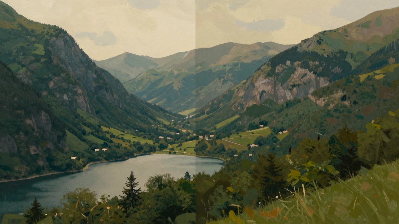
The Traditional Path: Painting from a Photo
If you're going the traditional route, avoid the temptation to paint directly from a phone screen. The backlight of a screen tricks your eyes into thinking colors are brighter than they actually are. Instead, print the photo or use a Grid Method, which is a technique of drawing a grid over a photo and a matching grid on the canvas to ensure accurate proportions.
Start with a "wash" of color. If you're painting a forest, cover the canvas in a light green or ochre. This removes the scary white space and sets the overall temperature of the piece. Work from the back to the front. Paint the sky first, then the distant mountains, then the trees, and finally the grass in the foreground. This prevents you from having to "paint around" things you've already done. For those using Acrylics, remember that you can layer light colors over dark ones once they are dry, which makes it easy to add highlights like sunlight hitting a rock or foam on a wave.
The Modern Path: Digital Transformation
Digital art isn't just about using a filter. To get a painting look, you need to mimic the way a human hand moves. Using software like Adobe Photoshop or Procreate, start by importing your photo as a bottom layer. Lower the opacity and create a new layer on top.
Instead of tracing the photo, use a "paint brush" tool with a bit of texture. Pick a color from the photo using the eyedropper tool, but then shift the hue slightly to make it more vibrant. Focus on the "big shapes" first. Use a large brush for the sky and ground. As you move toward the foreground, switch to smaller brushes for the details. A pro tip here is to use a "Smudge Tool" or a blending brush to soften the edges between colors, which creates that blended, oil-paint effect without the mess of actual turpentine in your living room.
Common Pitfalls to Avoid
The biggest mistake beginners make is using pure black for shadows. In nature, shadows are rarely black; they are usually deep blues, purples, or greens. If you look at a shaded area in a forest, it's likely a dark indigo or a burnt sienna. Using a "chromatic black" (mixing dark blue and brown) makes your landscape look alive rather than flat.
Another trap is the "over-detailing" bug. You don't need to paint every single blade of grass. Instead, use a few strategic strokes of a brighter green to suggest grass, and let the viewer's brain fill in the rest. This is called "suggestive painting," and it's what makes a piece of art feel like a painting rather than a low-resolution photograph.
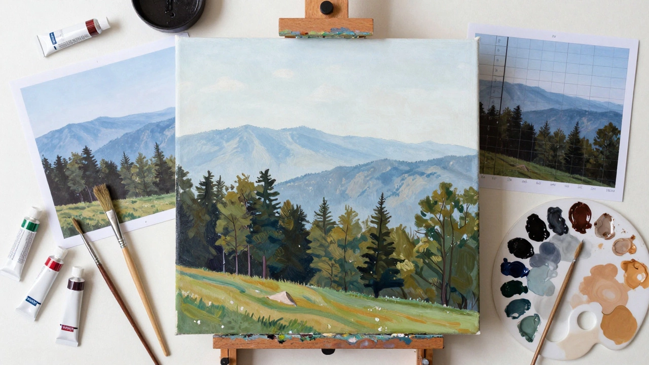
Adding the Final Artistic Touch
Once the main shapes are down, it's time for the "magic hour" touches. Look at your photo and identify the primary light source. Is the sun setting? Is it a cloudy day? Add highlights using a color that is a step lighter and warmer than your base color. For example, if your trees are dark green, use a pale yellow-green for the tips of the leaves where the sun hits them.
Finally, consider your edges. Hard edges feel clinical and photographic. Soft, blended edges feel natural and painterly. Use a dry brush or a blending tool to soften the horizon line where the land meets the sky. This creates a sense of distance and air, making the painting feel like it can be breathed in.
What is the best way to transfer a photo to a canvas?
The Grid Method is the gold standard for accuracy. You draw a grid of equal squares over your photo and the same grid on your canvas. This allows you to focus on one small square at a time, making it much easier to get the proportions right without getting overwhelmed by the whole image.
Can I use AI tools to help turn my photo into a painting?
Yes, AI can be a great starting point for inspiration or "blocking in" colors. However, relying solely on a filter often results in a generic look. The best approach is to use AI to generate a stylized version of your photo, then use that as a reference for a hand-painted piece, adding your own human touch and emotional intent.
How do I make the colors in my painting look as vivid as the photo?
Avoid using color straight from the tube. Instead, mix your colors to create depth. To make a color pop, place it next to its complementary color (like a bright orange sunset against a deep blue sky). This contrast makes the colors appear more vibrant than they actually are.
Which brushes should I use for landscape details?
For broad areas like skies, use large flat brushes. For trees and foliage, "fan brushes" are incredible for creating a natural, leafy texture. For fine details like thin branches or distant birds, a small round detail brush is essential.
How long does it take for a photo-to-painting project to dry?
If you're using acrylics, they dry in minutes to hours. If you're using oils, be patient-they can take days or even weeks to be dry to the touch, and months to fully cure. This is why oils are great for blending, as you can move the paint around for a long time.