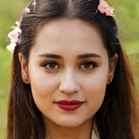
Portrait Proportions & Lighting Calculator
Calculated Proportions
Where are the Highlights?
Where are the Core Shadows?
Reflected Light Tip
Ever stare at a finished portrait and feel like something is just... off? The eyes are too wide, the nose looks pinched, or the face feels flat despite your best efforts with shading. You’re not alone. Even seasoned painters struggle with this. A great portrait isn’t just about copying what you see; it’s about translating three-dimensional reality onto a two-dimensional surface while keeping the soul of the subject intact.
Making a portrait look good boils down to three pillars: accurate structure, convincing light, and genuine expression. If one of these fails, the whole image wobbles. Let’s break down exactly how to fix those common pitfalls and start painting portraits that actually look like the person you’re trying to capture.
Start with Structure, Not Details
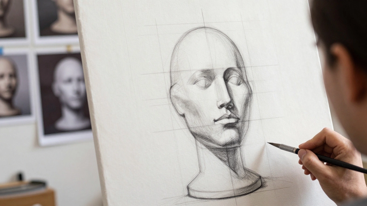
The biggest mistake beginners make is jumping straight into drawing the eyes or lips. Don’t do it. A portrait is built on a scaffold. If the scaffold is crooked, no amount of beautiful brushwork will save it. Think of the head as an egg shape sitting on top of a neck cylinder. This simple geometric approach helps you place features correctly before you worry about texture.
Use the "rule of thirds" for vertical placement. The top of the ears aligns with the eyebrows, and the bottom of the ears aligns with the base of the nose. The eyes sit roughly in the middle of the head vertically, not halfway down the face from the chin. This counterintuitive fact trips up many artists who instinctively place eyes lower than they should be.
- Eye spacing: Leave enough room for one eye between the two eyes. Crowded eyes make a face look alien.
- Nose width: The corners of the nostrils usually align with the inner corners of the eyes.
- Mouth width: The corners of the mouth generally align with the pupils, not the center of the eyes.
Sketch lightly. Use a grid method if you’re struggling with proportions. Divide your reference photo and your canvas into equal squares. This forces you to look at angles and relationships rather than getting distracted by individual features.
Master the Play of Light and Shadow
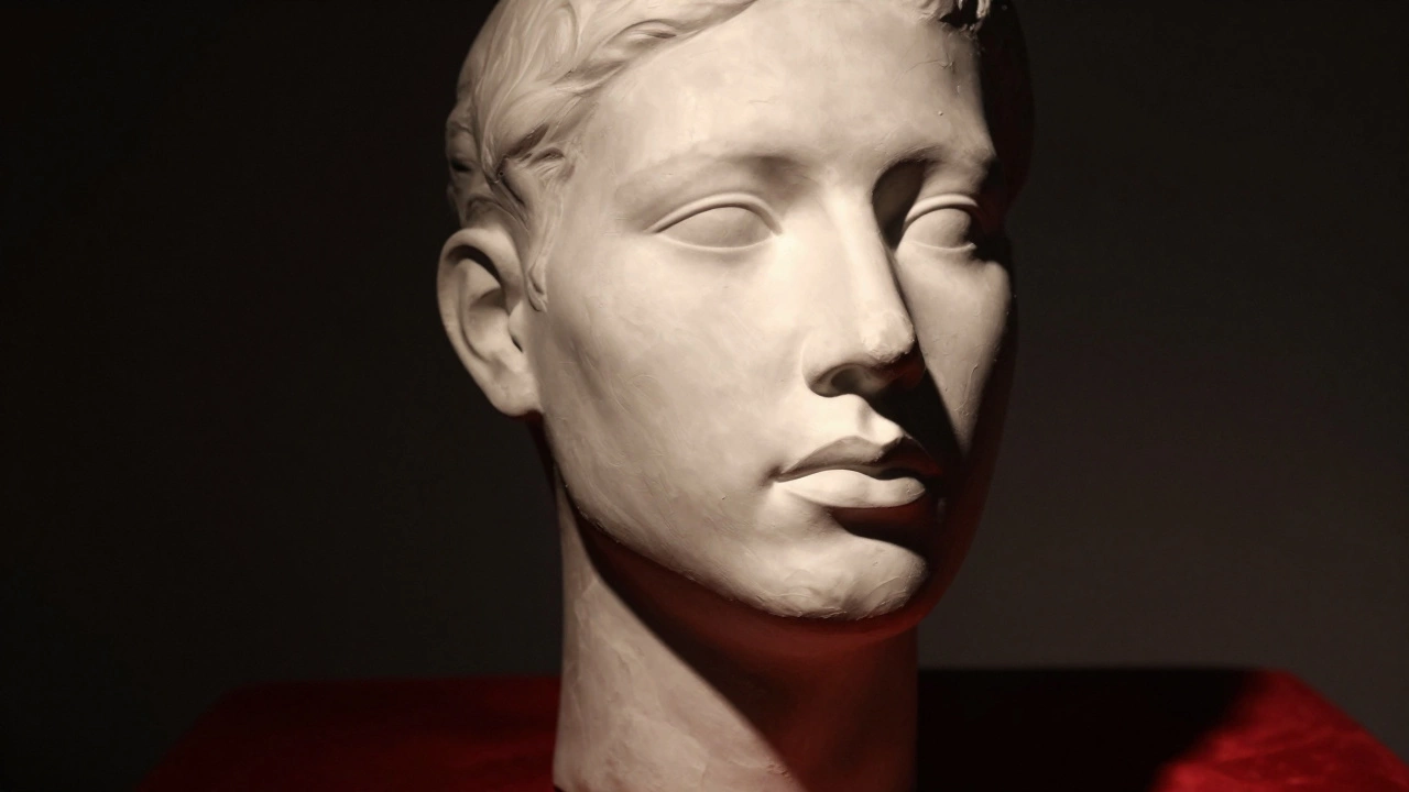
A flat portrait looks like a mask. To give your subject volume, you need to understand how light interacts with form. Human skin is translucent, which means light doesn’t just bounce off the surface; it penetrates slightly and scatters back out. This creates soft, warm transitions rather than harsh lines.
Identify your light source first. Is it coming from above, below, or the side? Once you know where the light is, map out the five basic tones: highlight, mid-tone, core shadow, reflected light, and cast shadow.
| Tone | Location | Visual Effect |
|---|---|---|
| Highlight | Where light hits directly (nose bridge, forehead) | Brightest area, often cool or neutral depending on light source |
| Mid-tone | The local color of the skin | Most common value, defines the base hue |
| Core Shadow | Where the form turns away from light | Darkest part of the object itself, rich in color |
| Reflected Light | Inside the shadow area | Bounces back from surrounding objects, adds depth |
| Cast Shadow | On the background or other parts of the face | Darkest overall, sharp edges near the object |
Paying attention to reflected light is crucial. Shadows aren’t black holes. They contain color. If your subject is wearing a red shirt, expect a faint red glow in the shadows of their cheek. This subtle detail makes skin look alive rather than muddy.
Capturing the Eyes: Windows to the Soul
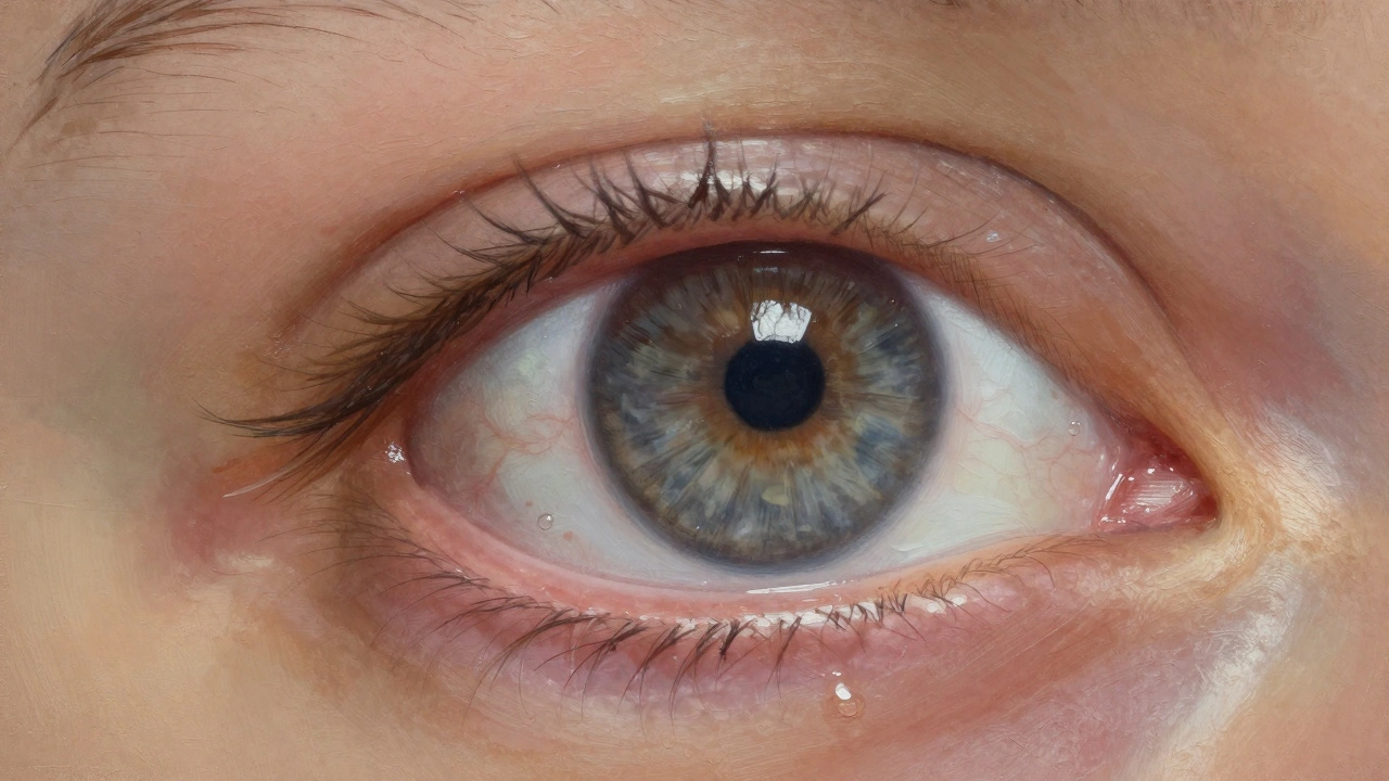
If there’s one feature viewers scrutinize most, it’s the eyes. Badly painted eyes ruin even the most structurally sound portrait. The eye isn’t just a white ball with a colored circle. It’s a complex sphere covered by a moist membrane.
Start with the iris. Paint the iris first because it sits behind the cornea. Add radial lines to mimic the texture of the iris fibers. Then, paint the pupil. Keep the pupil dark but not pure black-add a tiny touch of deep blue or brown to keep it organic.
Now, add the whites of the eyes (sclera). They are rarely pure white. They take on the ambient light and often have a slight yellow or pink tint due to blood vessels underneath. Finally, glaze a thin layer of transparent medium over the entire eye to simulate the wetness of the tear film. This glossy finish creates the illusion of moisture.
Don’t forget the catchlight. That small reflection of the light source in the eye gives the subject life. Without it, the eyes look dead or glassy. Place the catchlight consistently in both eyes based on your light source direction.
Skin Texture and Color Mixing
Green paint is your best friend when mixing skin tones. Why? Because human skin contains yellow, red, and blue pigments. When you mix complementary colors, they neutralize each other. Adding a tiny bit of green to a reddish-orange mix kills the brightness and creates a natural, fleshy tone.
Avoid using pre-mixed tube paints for skin. They often look plastic-like. Instead, build your palette with cadmium yellow, alizarin crimson, titanium white, and a touch of viridian green. Mix large batches of your base mid-tone so you can adjust values without changing hues unexpectedly.
Texture matters too. Skin isn’t smooth marble. It has pores, fine hairs, and wrinkles. In oil or acrylic painting, use a dry brush technique to stipple texture onto the cheeks and forehead. For smoother areas like the chin or nose bridge, blend thoroughly. Contrast between smooth and textured areas enhances realism.
Expression and Likeness
You can have perfect proportions and lighting, but if the expression is wrong, the portrait won’t look like the person. Likeness comes from the unique arrangement of muscles around the eyes and mouth. These micro-expressions tell the story.
Look closely at the crow’s feet. Are they deep creases or faint lines? How does the skin fold under the chin when they smile? These details are specific to the individual. Copying generic expressions results in a stock-photo look. Study your reference intensely. Notice asymmetries. One eyebrow might be higher than the other. One lip might be fuller. Emphasize these quirks.
Also, consider the gaze. Where is the subject looking? Direct eye contact creates intimacy. Averted gaze suggests contemplation or shyness. Align the pupils precisely. Even a millimeter shift can change the perceived emotion entirely.
Common Pitfalls to Avoid
Even with good technique, habits can sabotage your work. Here are the most frequent errors:
- Muddy colors: Overmixing paints destroys vibrancy. Keep your brushes clean and limit the number of colors mixed together.
- Harsh outlines: Faces don’t have black lines around them. Edges should be lost and found. Soften edges in shadow areas and sharpen them in highlights.
- Igoring the background: The background frames the face. A busy background distracts from the subject. Keep it simple and ensure the value contrast pushes the face forward.
- Overworking: Sometimes less is more. Stop when the likeness is clear. Adding too much detail can clutter the image and lose the big shapes.
Tools and Materials That Help
Your tools influence your outcome. For beginners, a round synthetic brush set offers versatility for both blending and detailing. Hog hair brushes are better for initial blocking-in because they hold more paint and have a stiffer bristle.
If you’re working digitally, pressure-sensitive tablets are essential. Layers allow you to experiment with lighting without ruining your base drawing. Use adjustment layers to tweak contrast globally before committing to final colors.
Reference photos matter. Ensure your reference is high-resolution. Blurry references lead to blurry paintings. If possible, work from life. Nothing teaches you about light and form like observing a real person in front of you.
How do I fix a portrait that looks flat?
Flatness usually comes from a lack of value contrast. Check your darkest darks and lightest lights. Increase the difference between them. Also, ensure you’re modeling form with core shadows and reflected lights. Soften hard edges in shadow areas to create depth.
Why do my skin tones look orange or gray?
Orange skin often lacks enough blue or green undertones. Gray skin usually means you’ve added too much black or mixed complements excessively. Adjust by adding a touch of violet or green to warm tones, and boost saturation with pure reds or yellows for dull mixes.
What is the best way to draw symmetrical faces?
Faces are rarely perfectly symmetrical. Focus on relative placement rather than mirror images. Use a center line down the nose to check alignment of eyes and mouth. Flip your canvas horizontally periodically to spot asymmetry errors your brain has ignored.
Should I paint the eyes last?
Generally, yes. Painting eyes early can lead to overworking them while you focus on other areas. By saving them for the end, you ensure they are fresh, crisp, and aligned with the final lighting and expression of the piece.
How important is the background in a portrait?
Very important. The background provides context and contrast. A dark background makes a light face pop. A colorful background can reflect onto the skin. Keep it simple to avoid distracting from the main subject, but use it to enhance mood and depth.