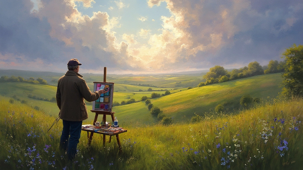
If you think painting a landscape is just about grabbing some green and blue, you’re missing out on the best part. Nature isn’t polite with its colours. Shadows aren’t just grey. Even on a ‘green’ hillside, you’ll find reds, violets, ochres, and sometimes a dash of blue you never expect. Think of the last time you took a walk: the sunlight flooding the grass wasn’t really “green”, was it? There’s a whole world hiding in plain sight—and picking the right colours is how you wake it up on canvas.
How Light and Weather Shape Your Landscape Palette
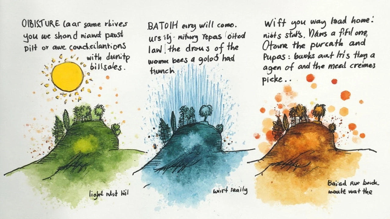
Here’s something weird that makes sense once you notice it: sunlight tricks your eyes. Artists from the days of Monet to now have obsessed over it. When the sun is high, shadows lean cool—shades of blue or violet. Late afternoon? Warm gold and ochre take over. On a cloudy day, greens go muted and a little moody. Warmth and coolness in your palette shouldn’t just be an afterthought—they are the soul of a scene. Impressionist painters obsessively recorded this; the actual pigments they used totally changed from morning to night. Want to punch up your own work? Try this experiment: paint the same view at noon and again at sunset. Study them side by side. Your colour choices will never be the same again.
Rain does funky things, too. Wet surfaces are darker and more reflective. Colours get deeper, not just muddier. The glaze of rain livens up browns and makes tree trunks almost shimmering. If you want drama (and who doesn’t love drama?), push those contrasts. Use ultramarine for deep, rainy shadows or hints of burnt sienna for earth soaking up the wet. If you peek at studies by Turner or contemporary plein air painters, you’ll spot this in action—big, confident swathes of dark and shine.
If you want proof, look up the famous experiment with paint chips under different lighting—yellow under cool daylight looks almost green, while the same chip under a regular bulb reads orange. Light really does warp what we see, so you want to capture that mood in your colours.
Essential Colours Every Landscape Painter Should Try
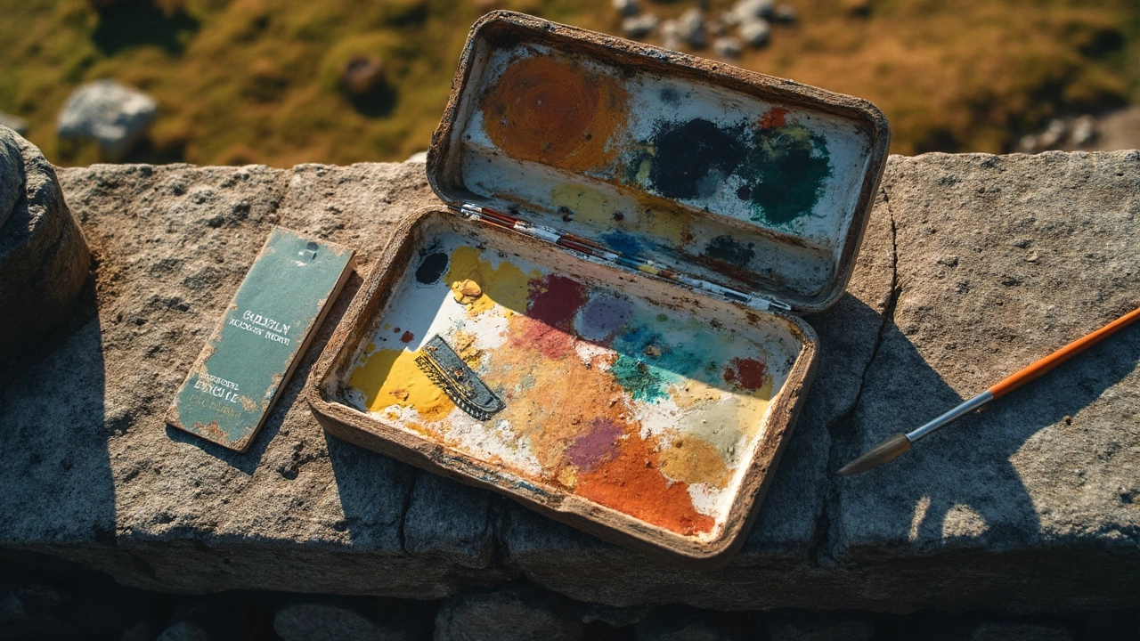
Your local art shop may tempt you to buy every tube available, but let's keep it simple. The pros usually start with a limited palette and expand only if needed. Why? Mixing makes your colours more natural—and weirdly, more harmonious.
- Ultramarine Blue: The workhorse for skies, distant hills, and even deep shadows.
- Cerulean Blue or Phthalo Blue: Handy for bright skies or mixing lively greens.
- Cadmium Yellow (or Hansa Yellow for less toxicity): Greening up fields or brightening foliage.
- Yellow Ochre: For earth, dry grass, and sun-baked scenes.
- Alizarin Crimson (or Permanent Rose): Shadows, earth, and mixing greens that don’t look fake.
- Burnt Sienna: Ground, tree bark, or muddying foliage a touch.
- Titanium White: For blending and highlights—though use sparingly; real sunlight is rarely that white.
Notice something missing? Pure, out-of-the-tube green almost never looks right outdoors. Most painters mix their own. For example, combine blue and yellow to taste, then tweak with a dash of red or sienna if things get too ‘artificial’ looking. Just watch wild grass on a windy summer day: there’s every shade from yellow-green to shadowy blue. Paying attention to these variations gives your painting that alive, breathing feeling.
Some popular contemporary artists—like Jessica Henry and Ian Roberts—favor palettes with just six to eight colours. Why? Fewer tubes mean every mixed colour naturally harmonizes. Try it yourself: aim for a ‘Zorn palette’ (white, red, yellow ochre, and black) for muted, misty scenes, or add blue for a lift.

The Secret Life of Greens (And How to Avoid the Cheeseball Look)
Let’s get real about greens: they’re weirdly tricky. If you’ve ever used sap green or viridian straight from the tube, you’ve probably muttered, “Why does my meadow look radioactive?” Real landscapes are made of dozens of greens, but “nature green” is usually less intense and more nuanced than what you’ll find at first glance.
Mixing your own is the trick. Pair blue and yellow, then modify. For warm, mossy greens, try ultramarine blue plus yellow ochre. For brighter highlights, add lemon yellow or cadmium yellow to cerulean blue. To knock a green back—make it less harsh—touch in a little complementary colour, like a dash of red or burnt sienna. This “greying down” makes the landscape feel more real.
Try blending a mid-tone green, then compare it to the actual moss or leaves outside. Bet it isn’t what you expected. I’ve even seen master painters use bright purple or pink tints in their greens—not because they’re literal, but because nature throws surprises. Shadows under evergreens might have a sneaky blue or almost lavender undertone, especially mid-morning or late afternoon. Take a photo next time and neutralize the colours—you’ll see those undertones pop out.
Here’s a quick landscape painting colours guide for beginners:
- Ultramarine + Yellow Ochre = Olive, forest undertones
- Cerulean + Lemon Yellow = Vibrant, sunlit grass
- Phthalo Blue + Cadmium Yellow Deep = Bright but believable meadows
- Knock back with a little red or burnt sienna for depth
Don’t just assume grass is green. Even a cat like Whiskers knows the grass she sprawls in glows gold at sunset. (She’s got a good eye for warm patches, too.)
From Mountains to Skies: Picking Colours for Depth and Atmosphere
Selling the illusion of distance on a flat surface is half the fun. Colour plays a starring role here. Take a look at real mountain ranges—the distant ones look bluer and lighter, even almost translucent. This effect is called 'atmospheric perspective' and the science behind it is as cool as it sounds. As distance increases, the atmosphere scatters blue light, making faraway objects shift toward blue and lose contrast.
Nearer subjects lean warmer and more saturated. That old barn in front? You get to amp up the ochres, reds, maybe even turquoise in the roof. For the far fields, start muting: mix in more ultramarine, maybe a touch of white, and pull back on yellows or reds. Some artists even use a little purple or lavender in the furthest shadow lines because, surprisingly, our brains read those cool tints as 'far away.'
Skies are their own beast. Daytime skies shift from a deep, almost cobalt ceiling overhead to a sweet pale blue at the horizon. There's a scientific reason: the atmosphere thickens as you stare lower, scattering more light and washing out colours. You can mimic this with cerulean at the top, blending down to white or even yellow-tinged sky near the bottom. If you’re after sunset, layer in soft pinks, oranges, and violets—don't be shy, nature is bolder than you think. A fun fact? The world’s record for most shades of blue named in one painting goes to J.M.W. Turner, who used at least 27 named blues across his works, according to the Tate Museum’s pigment analysis.
Check out this handy data on popular landscape pigment choices among professional plein air painters:
| Pigment | Common Subject Use | % of Artists Using |
|---|---|---|
| Ultramarine Blue | Skies, shadows, water | 97% |
| Burnt Sienna | Earth, bark, mixing | 89% |
| Yellow Ochre | Fields, sunlit areas | 85% |
| Alizarin Crimson | Warm shadows, flowers | 78% |
| Cerulean Blue | Skies, highlights | 72% |
Knowing what the pros actually use is like peeking in someone’s kitchen—you’ll realize that the most vibrant landscapes come from thoughtful, often surprisingly limited, colour choices.

Personal Touches and Practical Tips: Making Your Landscape Yours
No two artists’ palettes look exactly the same. You might find yourself reaching for a quirky pink or a bold turquoise. Don’t fight your instinct. Some of the most memorable landscapes pop because the artist let loose—think of David Hockney’s neon rivers or Georgia O’Keeffe’s stark blue-red mesas. Your scene doesn’t have to copy what’s there to feel real.
Here are a few low-stress strategies for tackling colour in your next landscape:
- Make a thumbnail sketch in black and white first—map out value before worrying about hue. You’ll see where light actually lands.
- Step outside during different times of day. Record the same spot in photos and compare how light alters everything about the palette.
- Limit your paints. Try the classic 'primary triad' (blue, red, yellow) plus white. See how far you can push the mix.
- Keep a scrap piece of canvas for testing. Blot mixes next to each other before committing them to your artwork. Whiskers is always trying to step on mine, possibly adding her own 'texture.'
- If you’re a fan of acrylics or gouache, remember that some colours dry darker—especially blues and greens. Do a quick swatch test every time you try a new tube.
- When working outdoors, beware strong sun: it makes all colours look lighter. Move a little farther away to judge your work in the shade.
One quirky but surprisingly practical tip from my partner Graham: once, while painting a windswept field, he used a literal mud sample as colour reference. Blending a bit of burnt sienna and yellow ochre, he matched the soil exactly—and the field popped against the green grass in a way that photos could never capture. Sometimes the best colour study is just staring at the real thing, then finding your closest match in paint.
By tuning in to the real-life tricks that nature plays—whether it’s the unexpected cool shadow, the surprise purple in a morning sky, or the warm hug of golden light—you’ll choose paints that make your landscape feel alive. Try a new palette, study the world with fresh eyes, and remember: the best landscapes don’t just show what you see. They show how you feel standing in the middle of it.

