Underpainting Color Selector
Select a subject above to see recommended underpainting colors and tips.
Quick Reference Guide
| Color | Best For | Effect |
|---|---|---|
| Burnt Sienna | Portraits, Warm Landscapes | Adds warmth, makes skin glow |
| Raw Umber | General Purpose, Shadows | Neutral base, forgiving |
| Grisaille (Gray) | Realism, Classical Studies | Luminous depth via glazing |
| Verdaccio (Green) | Flesh Tones | Natural skin tones, reduces redness |
| Cadmium Yellow | Impressionism, Light Scenes | Vibrant light, broken color effects |
You stare at a blank canvas, brush hovering, wondering if you should start with white, gray, or maybe that burnt sienna tube sitting on your palette. The choice feels huge because it dictates the mood of the entire piece. Here is the truth: there is no single "best" color. But there is a best color for your specific goal. Choosing the right underpainting is about controlling value, temperature, and time.
Underpainting is a foundational layer applied to a primed surface before the final colors are added. It acts as a roadmap for light and shadow. Think of it like sketching in charcoal but with paint. It solves the terrifying problem of the white canvas glaring back at you. More importantly, it establishes the tonal structure early, so you aren't fighting against the paper's brightness later.
Why You Need an Underpainting (And Why White Is Usually Wrong)
Starting directly on a white ground is risky. White reflects too much light, making it hard to judge mid-tones accurately. If you paint a medium blue over pure white, it looks lighter than it actually is. Once it dries, it might look muddy or washed out. An underpainting neutralizes this glare. It creates a middle-ground value that lets you see both lights and darks clearly.
Beyond optics, it saves time. Mixing opaque paints takes effort. If your underpainting already handles the shadows, you only need to add highlights and local color. This speeds up the process significantly. Plus, certain pigments have chemical properties that interact beautifully with the layers above them. For instance, warm underlayers make cool top layers pop through optical mixing.
The Classic Choices: Earth Tones and Grays
Historically, painters didn't have access to synthetic pigments. They relied on earth tones. These remain popular today because they are stable, transparent, and easy to work with.
Burnt Sienna and Raw Umber
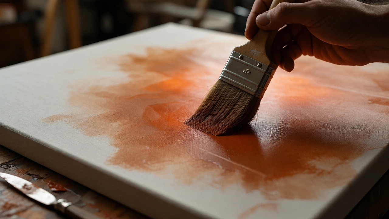
If you want warmth and energy, go with earth tones. Burnt Sienna is a reddish-brown pigment derived from iron oxide. It’s fantastic for portraits and landscapes where sunlight plays a role. It creates a vibrant base that makes skin tones glow. However, it can be tricky. If you leave too much of it showing through thin glazes, the whole painting might turn orange. Use it sparingly in shadow areas and let it peek through in subtle ways.
Raw Umber is cooler and darker. It’s excellent for establishing deep shadows without adding color bias. Many beginners find it forgiving because it doesn’t compete with subsequent colors. It provides a neutral, slightly brown foundation that supports almost any palette.
Grisaille: The Monochromatic Masterclass
For classical realism, nothing beats grisaille. This technique involves painting entirely in shades of gray. You build up values using black, white, and perhaps a touch of blue or brown to adjust temperature. Grisaille forces you to focus solely on form and light. When you apply translucent glazes of color over a dry grisaille, the colors appear luminous because the light passes through the glaze, hits the reflective white/black layers, and bounces back.
This method is slow. It requires patience. But the results are unmatched for depth. Artists like Rembrandt used variations of this approach. If you struggle with color harmony, grisaille removes that variable until you’re ready to introduce hue.
Verdaccio: The Green Secret
You might hear about verdaccio, a green-gray underpainting often associated with Italian Renaissance masters. Why green? Because green is the complementary color to red. Human skin has red undertones. By laying down a greenish base, the reds in the flesh tones feel more natural and less flat when applied on top. It prevents portraits from looking like plastic dolls. This is particularly useful for realistic figure painting.
| Color Type | Best For | Drying Time | Difficulty Level |
|---|---|---|---|
| Burnt Sienna | Portraits, Landscapes, Warm Scenes | Fast (1-2 days) | Moderate (Risk of orange cast) |
| Raw Umber | General Purpose, Dark Shadows | Medium (2-3 days) | Low (Forgiving) |
| Grisaille (Gray) | Realism, Classical Studies | Slow (Days to Weeks) | High (Requires value control) |
| Verdaccio (Green) | Flesh Tones, Portraits | Medium | Moderate (Needs color theory knowledge) |
| Cadmium Yellow | Luminous Highlights, Impressionism | Fast | Low (Simple application) |
Modern Approaches: Breaking the Rules
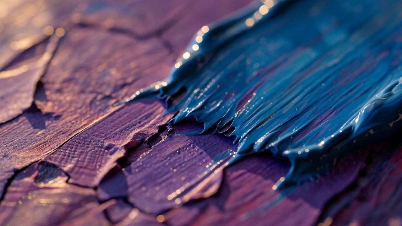
You don’t have to stick to history books. Contemporary artists often use bright, saturated colors for underpaintings. Imagine painting a night scene over a vivid purple ground. The darkness of the sky will feel richer because the purple vibrates beneath the black strokes. Or try a yellow ground for a sunny beach scene. Even if you cover most of it, the yellow flashes through gaps, adding a sense of intense light.
This approach works well for impressionistic styles where texture and broken color matter. It encourages spontaneity. You aren’t trying to create a perfect monochrome study; you’re creating a dynamic substrate. Just be careful with opacity. If your top layers are too thick, the underpainting disappears completely, wasting the effort.
How to Choose Based on Your Subject
Decide based on what you are painting. Here is a quick decision tree:
- Portraits/Figures: Start with Burnt Sienna for warmth or Verdaccio for natural skin tones. Avoid cool grays unless you want a ghostly effect.
- Landscapes: Raw Umber is safe and versatile. For autumn scenes, Burnt Sienna adds atmosphere. For winter, a cool gray or blue-gray works better.
- Still Life: Match the dominant tone. If painting fruit, a warm ochre ground helps. If painting metal or glass, a neutral gray allows reflections to stand out.
- Abstract Art: Experiment. Use complementary colors to create vibration. Try red under green, or blue under orange.
Practical Tips for Application
Keep it thin. Underpainting should not be a heavy impasto layer. Mix your pigment with plenty of solvent or medium to create a wash-like consistency. This ensures it dries quickly and doesn’t crack later. Remember the rule: "Fat over lean." Since underpainting is usually lean (less oil), your subsequent layers can contain more oil.
Let it dry properly. Rushing this step causes adhesion problems. Depending on the thickness and humidity, wait at least 24 to 48 hours. If you use fast-drying mediums, check the surface by touching a hidden corner. It should feel tacky but not wet.
Don’t overwork it. The goal is suggestion, not detail. Block in the major shapes of light and shadow. Leave edges soft. Hard details belong in the upper layers. If you refine every contour now, you’ll lose flexibility later.
Common Mistakes to Avoid
One big mistake is using too much black in a grisaille. Black can kill transparency and make the painting look dead. Instead, mix Ultramarine Blue and Burnt Umber to create a rich, deep dark that retains chromatic interest. Another error is ignoring temperature shifts. If your underpainting is uniformly warm, your cool shadows will look disjointed. Vary the temperature across the canvas-warm lights, cool shadows-to create depth.
Also, avoid using expensive pigments for underpainting. Save Cadmiums and Cobalts for the final layers. Use cheaper, staining earth colors for the base. There is no benefit to using a $50 tube of Titanium White for a scratch coat.
Next Steps for Your Painting
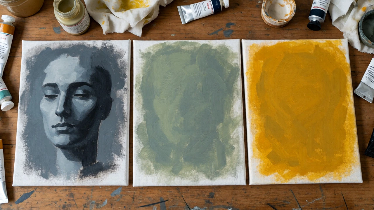
Start small. Take a scrap piece of canvas board. Try three different underpaintings: one with Burnt Sienna, one with Gray, and one with Yellow. Paint the same simple object on each. Observe how the final colors behave. Which one felt easiest? Which one produced the most pleasing result?
Your preference will evolve. Many professionals switch methods depending on the commission or personal mood. The "best" color is the one that gets you painting confidently without second-guessing every stroke.
Can I skip underpainting altogether?
Yes, especially if you paint alla prima (wet-on-wet) in a single session. However, skipping it means you must manage values carefully from the start. Underpainting acts as a safety net for multi-session paintings.
Does the color of the primer matter?
It does. A tinted primer (like gray or beige) reduces glare compared to pure white gesso. Some artists prime with colored grounds themselves to save time on the first layer.
What medium should I use for underpainting?
Use turpentine or odorless mineral spirits to thin the paint. This creates a lean layer that dries quickly. Adding a bit of alkyd medium can speed up drying further if you are impatient.
Is acrylic underpainting okay for oil paintings?
Absolutely. Acrylic dries instantly, allowing you to start oil painting within minutes. Just ensure the acrylic layer is fully cured (not just dry to the touch) to prevent cracking. This is a common studio practice.
How do I fix a bad underpainting?
If it’s still wet, wipe it off with a rag and solvent. If it’s dry, you can paint over it with opaque colors. If the color bleeds through unwantedly, apply a thin barrier layer of white or gray before continuing.