Landscape Painting Colours – Simple Tips for Natural‑Looking Outdoor Art
Ever wonder why some landscape paintings grab your eye instantly while others feel flat? The secret usually lives in the colours you choose. Picking the right hues, mixing them right, and applying them with purpose can turn a simple sketch into a scene that feels alive.
Choosing the Right Temperature
Start by deciding if you want a warm or cool feel. Warm colours (reds, oranges, yellows) push the eye forward and make a sunrise or desert look inviting. Cool colours (blues, greens, violets) recede and work great for shadows, water, or a misty morning. Mix a touch of warm into cool sky blues to keep the light from looking dull.
Building a Simple Palette
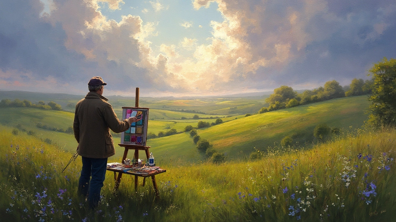
You don’t need a rainbow of tubes. A limited palette of five to seven colours lets you mix more shades and stay consistent. A classic set might include a warm yellow, a cool yellow, a cadmium red, a ultramarine blue, a sap green, and a burnt sienna. From these, you can create everything from golden fields to deep forest shadows.
Value – the lightness or darkness of a colour – matters more than hue. Paint a quick value study in charcoal or a single colour to map out where light hits and where shadows fall. Then match your colours to those values, so the painting reads clearly from a distance.
When you work from a photo, don’t copy the exact colours. Cameras often boost saturation, so tone them down a bit. Use the photo as a guide for composition, then adjust the palette to fit the mood you want to convey.
Sky and water share similar colour families, but water reflects the surrounding environment. Add a hint of the dominant land colour (green from trees, orange from a sunset) into the water to suggest depth and reflection.
Foliage isn’t just green. Mix a little yellow for sun‑lit leaves, a dash of red or purple for autumn tones, and a touch of blue for shadowed leaves. Layer these mixes to give trees a sense of volume without painting every individual leaf.
Before committing to a large area, test your mix on a scrap of canvas. A quick swipe shows how the colour dries, which can differ from the wet look on the palette. Adjust with a bit more white, a touch of complementary colour, or a little more saturation as needed.
Finally, keep a small wet‑on‑wet area to blend edges where sky meets land. A soft brush or a clean finger can smooth transitions and create that atmospheric look that makes a landscape feel real.
With these straightforward steps, you’ll pick landscape painting colours that bring your scenes to life, whether you’re working in oils, acrylics, or watercolour.
24 Jun 2025
Explore how to choose colours for landscape painting, with practical tips, science-backed facts, and examples. Discover what makes a palette truly work outdoors and how light, weather, and season affect your choices. Get actionable, creative advice for painting landscapes whether you’re a hobbyist or seasoned artist. Find out what pros keep in their paint box and how to make your scenes feel vibrant, real, and uniquely yours. This guide takes a deep and humorous dive—you'll never look at a field of green the same way again.
Continue reading...