Emotion in Art: Why Feeling Drives Every Piece
Ever wonder why some paintings grab you instantly while others feel flat? It’s the emotion behind the brushstroke. When an artist pours feeling into colour, line, or texture, the work talks directly to your brain. That direct connection is what makes a piece memorable and why the "emotion" tag matters.
How Artists Capture Feeling
Artists have a few tricks for turning a simple scene into a punchy emotional experience. Take the eyes in a portrait – they’re often the first thing a viewer notices. A focused gaze can make you feel intimacy, mystery, or even discomfort. That’s why many of our posts, like "Eyes in Portraits," highlight eye placement as a shortcut to deeper impact.
Abstract art works differently. It doesn’t tell a story with recognizable objects; instead, colour, shape, and brushwork create a mood. A bold red splash can feel aggressive, while soft blues calm the viewer. The article "What Does Abstract Art Really Mean?" explains how artists use these visual cues to deliver a clear emotional message without words.
Even the choice of medium adds feeling. Oil paints dry slowly, letting artists blend and create atmospheric depth, while acrylics dry fast and give a crisp, energetic vibe. Our guide "Acrylic vs Oil: Which Is Easier for Painting Portraits?" shows how each medium can reinforce the intended emotion.
Tips to Bring More Emotion Into Your Work
Start with a feeling, not a subject. Before you sketch, ask yourself what you want the viewer to sense – joy, tension, nostalgia? Write that word down and keep it visible while you paint. It guides colour selection and composition without you even realizing it.
Use colour deliberately. Warm tones (reds, oranges) naturally raise energy, while cool tones (blues, greens) soothe. Pair a bright accent with a muted background to draw the eye and amplify the emotional focal point. This simple contrast is a technique used in many of the pieces we feature.
Think about composition as a storytelling tool. The rule of thirds, for instance, places the main subject off‑centre, creating a sense of movement or imbalance that can heighten drama. Our "Rule of Thirds Guide for Stunning Landscape Paintings" breaks down how to set this up quickly.
Finally, let imperfections show. A slightly rough brushstroke or a glaze that peeks through can convey vulnerability. Viewers often connect more with work that feels human rather than perfectly polished.
Whether you’re painting a portrait, sculpting a figure, or experimenting with digital art, remember that emotion is the bridge between creator and audience. By focusing on eyes, colour, medium, and composition, you can turn any project into a memorable experience that resonates long after the viewer walks away.
10 Jun 2025
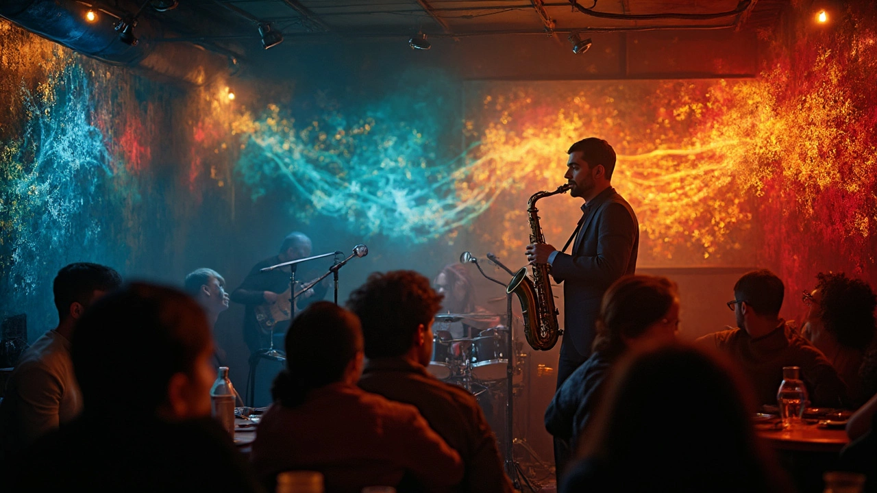
This article digs into the question of what color best describes jazz, blending science, history, and personal stories. Expect to learn how musicians and listeners actually perceive the sound of jazz in terms of color. Discover interesting tidbits about synesthesia and famous artists who connected colors and notes. Get practical tips on how to create your own visual map of jazz, even if you don’t play an instrument. By the end, you’ll see jazz with new eyes—and maybe even paint your next playlist.
Continue reading...