Ask ten people what color jazz is, and you'll get ten different answers. Some swear it’s blue—shout out to all the Blue Notes and 'kind of blue' albums—while others picture warm reds and golds, thanks to smokey clubs and flashy stage lights. But there’s more to this color debate than just guessing. Jazz actually makes people see colors, literally, for some folks with synesthesia. And for basically everyone else, the sound triggers a mix of feelings and images that can get surprisingly specific.
If you've ever shut your eyes during a sax solo and 'seen' a swirl of color, you’re not alone. That's your brain mixing sound and vision, which scientists call cross-sensory perception. Don’t worry, you don’t need special wiring to try it—anyone can tap into this by paying attention while listening. Doing this isn’t just fun; it’s actually a great way to understand what mood a jazz track is laying down, which can help if you make playlists, design album covers, or just like picking out which records fit your day.
- Seeing Sound: Where Color Meets Music
- Jazz in the Eyes of Synesthetes
- The Blues and Beyond: Picking Jazz’s Palette
- Album Art, Stage Lights, and Visual Vibes
- Turning Jazz Into Your Own Color Story
Seeing Sound: Where Color Meets Music
Humans have always tried to connect what we hear to what we see, and that goes double for music. Turns out, our brains love matching sound with color. This isn't random—psychologists call it cross-modal association. Basically, your brain picks up on certain sounds, like a smooth bass or bright trumpet, and starts linking them to images or even shades on the color wheel.
Jazz is especially interesting because it's full of extremes. Slow, chill tracks? Lots of people say they picture deep blues, maybe purples. Fast bebop or anything wild on the piano? You might imagine sharp yellows or fiery reds. Researchers from the University of California actually ran tests with volunteers and found most folks associate lower pitches with darker, cooler colors, and higher pitches with lighter, brighter ones. So, a deep double bass might feel navy blue, while a squealing sax solo could light up as yellow or orange in your mind.
This color-sound thing isn't just a cool party trick; it can seriously affect how we listen to music. Clubs and festivals use colored lights to set jazz moods—from calm blue washes for ballads to bold red strobes for ecstatic solos. If you’re building a playlist, you could pick album covers the same way, matching the mood of the music to the color on the cover. And if you just want to sit and listen, try closing your eyes and asking yourself what colors show up with certain *jazz* tracks. It might help you pick up on instruments and moods you never noticed before.
Jazz in the Eyes of Synesthetes
So, what happens when someone literally sees color every time they hear music? That’s what life is like for people with synesthesia—a real, studied condition where senses cross over. Maybe the most famous synesthete in the music world was Duke Ellington. He described hearing a D note as "dark blue, almost gray," and a G as "light blue satin." To him, every chord basically turned into a visual show. He wasn’t alone. Research from the University of Amsterdam found that about 4% of musicians experience some degree of sound-to-color synesthesia. That might not sound like much, but in a jazz band with twenty musicians, odds are at least one of them sees music this way.
So what colors pop up for jazz? According to synesthete reports collected by researchers, jazz often shows up in rich, bold hues. Improvised solos—think Coltrane or Miles Davis—might flash in sparkly yellows or electric greens, while slow blues tracks lean on deep indigo or smoky gray. And this isn’t just artistic talk: EEG studies actually recorded different brain activity in synesthetes, compared to non-synesthetes, when they listened to jazz instruments.
Here’s a look at colors jazz musicians with synesthesia have linked to some classic instruments:
| Instrument | Common Color Perceived |
|---|---|
| Saxophone | Gold or burnt orange |
| Trumpet | Bright yellow or silver |
| Piano | Black and white swirls, or pastel blue |
| Bass | Deep green or maroon |
Want to see if your brain is wired this way? Try the simple test researchers use: pick a jazz tune and focus on how it makes you feel and what colors—even faint ones—pop to mind. If you keep seeing the same color for the same notes or instruments over and over, you might be a low-key synesthete yourself. For the rest of us, we can still have a blast linking colors and sounds, even if our brains keep the wires straight.
The Blues and Beyond: Picking Jazz’s Palette
If you break down the idea of color in jazz, you’ll notice one color popping up everywhere: blue. It’s not just because of "the blues" as a genre—think about the album "Kind of Blue" by Miles Davis, one of the best-selling and most loved jazz records ever. Blue in jazz is more than a shade; it’s a mood. The term "blue notes" is right at the heart of the sound, describing notes played or sung at a slightly lower pitch to give a tune its unique, soulful vibe.
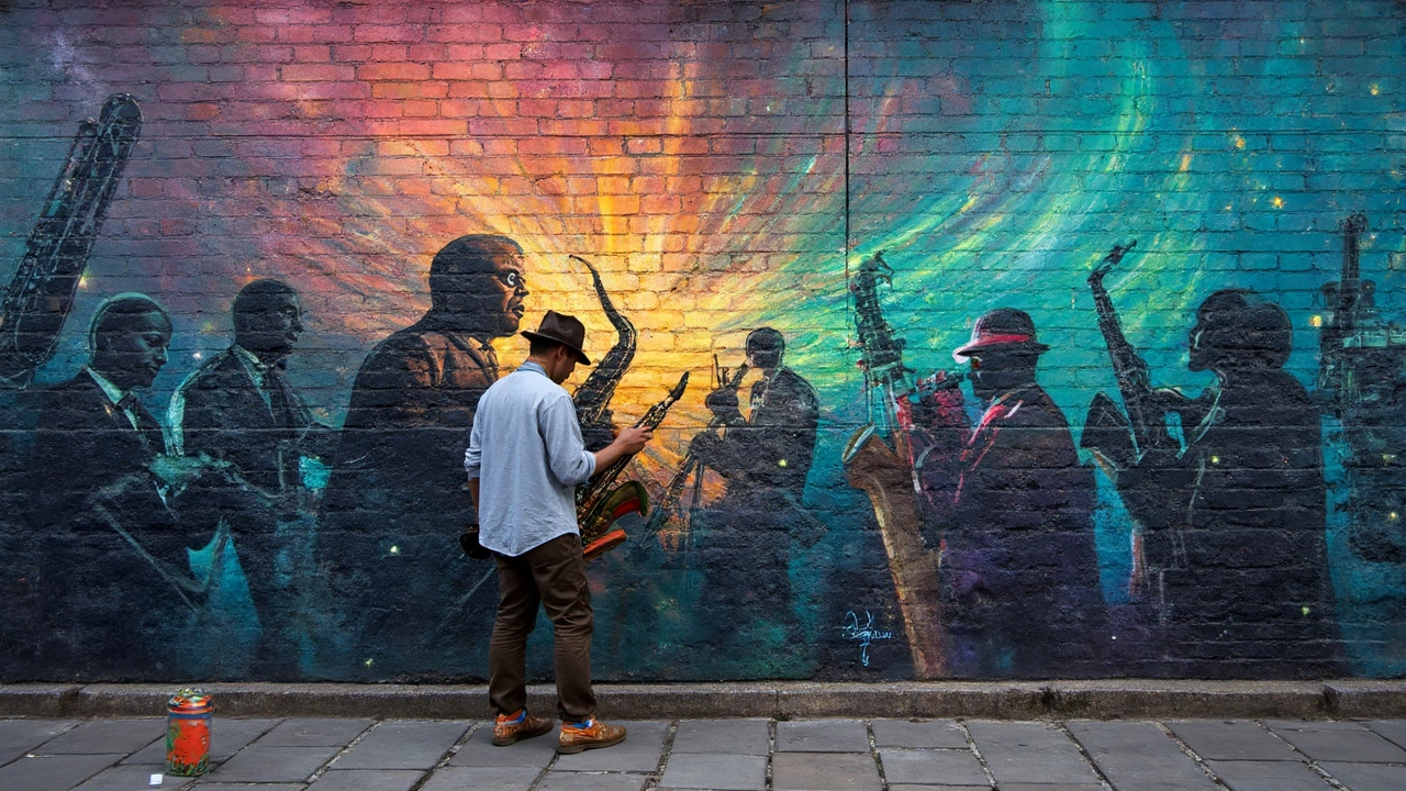
But jazz isn’t just blue. Over time, it’s soaked up all kinds of influences and moods, borrowing from New Orleans brass bands, Latin grooves, and swing dance halls. Each of those brings a whole new set of colors into the mix. For instance, the flashy reds and golds seen in New York jazz clubs during the roaring ‘20s, or the earthy tones you get from jazz-funk and fusion in the ‘70s.
Looking at album covers and stage designs gives you real proof of how the jazz palette has shifted. Early jazz records often leaned on deep blues and blacks with a pop of white or yellow, making the style feel cool but bold. Then, when free jazz came around in the ‘60s, covers and posters blew up with wild, clashing colors—think Sun Ra or Ornette Coleman records.
Here’s a quick rundown of how different jazz styles have lined up with colors over the years:
| Jazz Style | Era | Common Colors |
|---|---|---|
| Blues / Early Jazz | 1900s-1930s | Deep blue, black, white |
| Swing / Big Band | 1930s-1940s | Gold, burgundy, navy |
| Bebop / Cool Jazz | 1940s-1950s | Gray, pastel, turquoise |
| Free Jazz | 1960s | Bright primaries, orange, neon |
| Fusion / Funk Jazz | 1970s | Earthy browns, vivid reds, bronze |
Here’s a handy tip if you want to make your own jazz-inspired color palette. First, pick a style or era. Listen to a couple of tracks from that time—say, Dizzy Gillespie for bebop or Herbie Hancock for jazz-funk. Pay attention to the album covers and stage outfits from that period. Let those visuals feed into your design or playlist theme. Matching the color vibe to the sound makes the whole experience way richer, and you’ll probably never hear jazz the same way again.
One more fact: a 2015 study from the University of California, Berkeley, found that listeners linked sadder tunes to blues and grays, while upbeat jazz tracks got associated with yellows and bright reds. So, when you’re picking out your own jazz colors, it’s not just guesswork—there’s some real science behind those connections.
No matter the palette, jazz never sticks to one color. It’s always shifting, just like the music itself. That’s what keeps it interesting.
Album Art, Stage Lights, and Visual Vibes
Want to see how jazz gets its color? Just flip through classic album covers. Think about Miles Davis’ “Kind of Blue”—the cover uses deep blue-tinted photography, literally putting color to the music’s calm, moody feeling. Or check out Thelonious Monk albums; they often use bold reds or stark blacks, pushing the edgy, unpredictable side of jazz. Designers and musicians work together to cue us into the vibe of each record before we even listen.
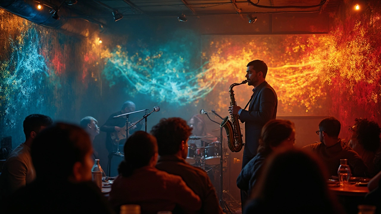
It’s not just album art, either. Walk into a jazz club in New Orleans or New York, and you’ll notice the stage lights. Warm yellow, burnt orange, or even dramatic purples and blues fill the room. These light choices aren’t random—they help set the mood, matching the style of music being played. During upbeat bebop numbers, you might see brighter lights. For a slow, late-night ballad, the lights turn soft and blue. Some clubs even sync up lighting to solos, so a trumpet riff might literally throw a spotlight on the player.
Stats show there’s a real connection between visual and audio choices in jazz:
| Element | Most Used Color | Purpose |
|---|---|---|
| Album Covers (1950-1970) | Blue | Reflect calm and introspection |
| Jazz Club Lighting | Warm Yellow/Orange | Invite relaxation and energy |
| Stage Spotlights | Purple/Red | Highlight solo performances |
If you want to use color to level up your own listening space, you don’t need expensive gear. Try experimenting with cheap LED bulbs. Found a jazz playlist that feels mellow? Try blue light. Want something punchier? Go for reds and oranges. Even simple choices, like swapping a lampshade or putting on a colored filter, change the whole mood. If you’re making a playlist cover or designing posters, pull color ideas from the actual music or famous album art for instant vibe points.
Turning Jazz Into Your Own Color Story
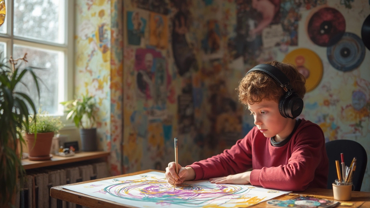
Turning music into color isn’t just for artists or people with synesthesia—anyone can give it a shot. There aren’t any strict rules, so you can play around until something clicks. When you listen to jazz, try connecting certain sounds or feelings to colors that come to mind. This personal tie between music and color makes the experience more vivid and memorable.
Try this step-by-step method:
- Pick a jazz track you like—maybe something classic like Dave Brubeck’s “Take Five” or something modern.
- Close your eyes and notice what you feel. Does the saxophone make you think of a cool blue? Do the drums give you orange flashes?
- Write down or sketch what you’re seeing. You could even use a simple color wheel from the internet.
- If you’re into digital stuff, open up a drawing app and make a quick visual mood board based on the track.
If you’re not sure where to start, check out what science and jazz musicians say. Studies from the University of California show that Major keys, which sound happy, usually map to brighter colors, while Minor keys, which sound darker or sad, line up with blues and purples. Jazz goes beyond that with odd chords and improvisation, so you’ll get a rainbow of choices.
Even album art follows these trends. Here’s a peek at how famous jazz albums matched their sounds to colors:
| Album | Main Color | Why It Fits |
|---|---|---|
| Miles Davis – Kind of Blue | Deep Blue | Reflects calm, cool, moody sounds |
| John Coltrane – Blue Train | Blue-Green | The color ties to the album’s name and its mellow vibe |
| Herbie Hancock – Head Hunters | Bright Yellow and Red | Matches energetic funk jazz tracks |
Go ahead and try matching songs to colors yourself. Keep a playlist with those vibes, or make a wall of color cards tied to your favorite tunes. This isn’t about getting it ‘right’—it’s about making jazz mean more for you. Not only does paying attention this way make you enjoy music more, but it’s also a great icebreaker when talking music with friends. Turns out, the color of jazz is whatever you see when the music hits.
And here’s a tip: If you ever DJ, using colored lights that match your jazz setlist is a simple way to create a whole mood in the room. Visuals and sound work best when they’re in sync—and nobody forgets a good vibe.
When you listen with your eyes and ears, jazz becomes a story with its own set of colors. That’s what makes it stick, and why people keep coming back for another listen.