Complementary Colors
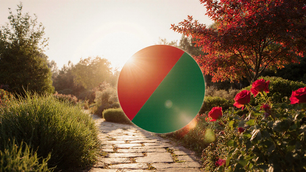
When working with complementary colors, a pair of hues positioned opposite each other on the color wheel that boost visual contrast and energy. Also known as opposite colors, they are a core concept in color theory, the study of how colors interact, affect mood, and guide composition. Artists rely on the color wheel, a circular diagram that maps hues in order, helping creators spot complementary pairs quickly to build striking palettes. Each hue – the pure shade without added white or black – carries its own temperature, and pairing a warm hue with its cool opposite creates a dynamic push‑pull effect that catches the eye.
Why Complementary Colors Matter in Different Art Forms
Whether you’re mixing wet‑on‑wet oils in an alla prima study or selecting digital swatches for a game UI, the contrast produced by complementary colors can make a composition pop. In landscape painting, using the best colours for landscape painting often means pairing sky blues with sunset oranges to convey depth and atmosphere; the opposite hues amplify the sense of distance. Digital artists looking at salary trends notice that clients value projects that demonstrate strong visual impact, which often comes from mastering contrast through complementary pairs. Photographers drafting fine‑arts portfolios also exploit this rule: a bright red subject against a green background instantly draws attention, a trick often highlighted in exhibition planning guides. Even sculptors choosing material finishes can think in terms of hue contrast—polished bronze against a matte stone backdrop creates a tactile visual dialogue. Across these mediums, the underlying principles remain the same: color theory tells us which hues oppose each other, the color wheel shows us the exact locations, and the hue itself defines the emotional temperature of the pair.
Getting comfortable with complementary colors means testing, tweaking, and learning where the balance lies. Start with a limited palette: pick a dominant hue, locate its opposite on the wheel, and then experiment with tints (adding white) and shades (adding black) to soften the clash while keeping the contrast alive. Many artists keep a reference chart of their favorite complementary combos—think teal‑orange for coastal scenes or violet‑yellow for vibrant portraits. Remember that contrast isn’t just about hue; saturation and value play roles too, so a muted pastel opposite a vivid primary can still deliver a punch without overwhelming the viewer. As you build confidence, you’ll notice faster decisions when planning an exhibition layout or drafting a digital illustration, because the color relationships are already mapped in your mind.
Below you’ll find a curated set of articles that dive deeper into each of these ideas—technique breakdowns, salary insights, job guides, and hands‑on tips—all tied together by the power of complementary colors. Explore the collection to see how the theory translates into real‑world practice, and pick up actionable advice you can apply to your next canvas, screen, or sculpture.
10 Oct 2025
Discover how to use complementary colors in landscaping with practical plant picks, hardscape tips, seasonal guides, and a handy FAQ to create vibrant, balanced gardens.
Continue reading...