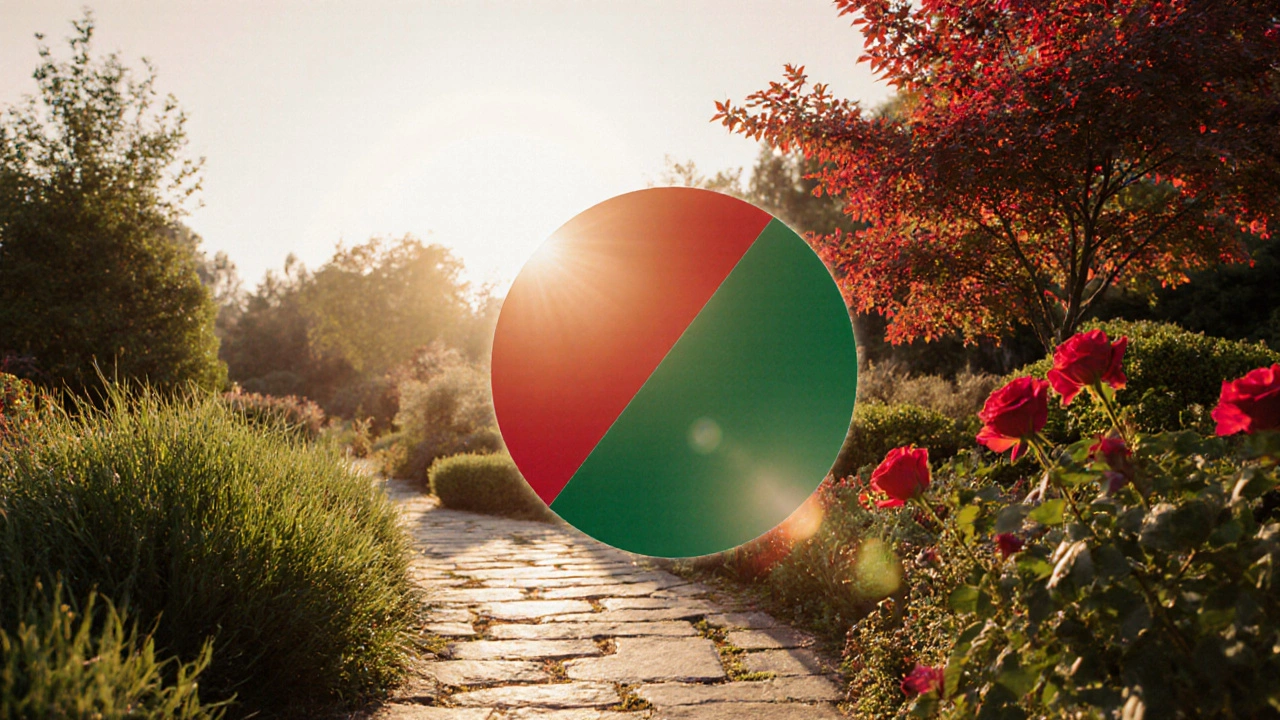
Complementary Color Pair Selector
Red ↔ Green
A classic combination that creates a bold yet balanced look.
Blue ↔ Orange
Creates a vibrant contrast perfect for summer gardens.
Yellow ↔ Purple
A cheerful pairing that brings life to any garden space.
Choosing the right colors for a garden can feel like a guessing game, but a simple color principle can take the stress out of it. When you pair hues that sit opposite each other on the color wheel, the result is a vibrant, balanced landscape that catches the eye without looking chaotic. Below you’ll discover which complementary color pairs work best in a garden, how to apply them with plants and hardscape, and a few tricks to keep the palette fresh throughout the year.
What are Complementary Colors?
Complementary colors are hues positioned directly across from each other on the color wheel. Classic examples include red ↔ green, blue ↔ orange, and yellow ↔ purple. Because they contrast strongly, they enhance each other’s intensity while still feeling harmonious when used together.
In landscaping, this principle lets you create eye‑catching focal points-like a burst of red roses against dark green foliage-without the garden looking over‑styled. The key is to balance the dominant color (usually the larger backdrop) with a smaller splash of its complement.
Why Complementary Pairs Shine in Garden Design
Two color‑theory concepts make these pairings especially useful:
- Color contrast creates visual tension that draws the eye to focal areas.
- Color harmony keeps that tension from feeling harsh, giving a cohesive look.
When you combine a strong background hue with a touch of its opposite, the garden feels dynamic yet orderly-exactly what most homeowners want.
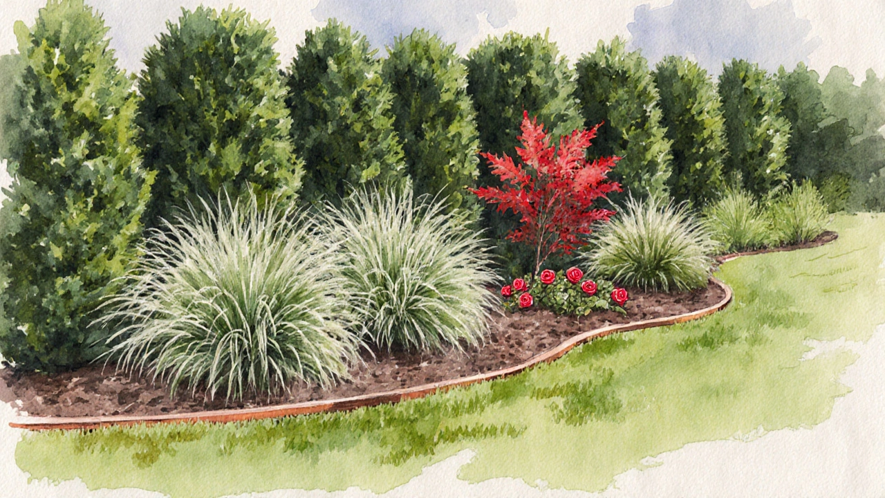
Core Complementary Pairs and Garden Examples
Below is a quick reference of the three primary complementary pairs and how they can be applied in a typical British garden.
| Pair | Background Plant (dominant hue) | Accent Plant (complement) | Hardscape Accent |
|---|---|---|---|
| Red ↔ Green | Foliage grasses, Boxwood | Rose, Dianthus, Japanese maple (red leaves) | Copper garden edging |
| Blue ↔ Orange | Lavender, Hydrangea (blue varieties) | Marigold, Calendula, Ornamental peppers | Terracotta pots |
| Yellow ↔ Purple | Yarrow, Goldenrod | Lavender, Salvia, Clematis (purple) | Slate paving stones |
Notice how each row suggests a dominant backdrop, a pop‑of‑color accent, and a material that echoes the accent hue. This three‑layer approach keeps the palette from feeling flat.
Plant Selections for Each Pair
Picking the right species matters. Here are a few reliable choices that thrive in the UK climate:
- Roses offer a range of reds that pair beautifully with deep‑green hedges.
- Lavender provides soft blue‑violet spikes perfect for orange flower companions.
- Hostas deliver foliage in shades of green that let red‑flowered peonies stand out.
- Japanese maple has striking red leaves that contrast with evergreen boxwood.
- Ornamental peppers show bright orange fruits against blue‑flowering thyme.
When you choose plants, think of the dominant color as the "canvas" and the complementary plant as the "stroke of paint." A few well‑placed accents are all you need.
Hardscape Materials That Reinforce the Palette
Hardscape isn’t just functional; it can echo your chosen colors without overwhelming the plantings. Consider these options:
- Copper or bronze planters and edging for red‑green schemes.
- Terracotta or glazed orange tiles for blue‑orange gardens.
- Dark slate or charcoal gravel for yellow‑purple settings.
Using a small amount-like a pot, a garden bench, or a stepping stone-makes the colour pop without stealing the show.
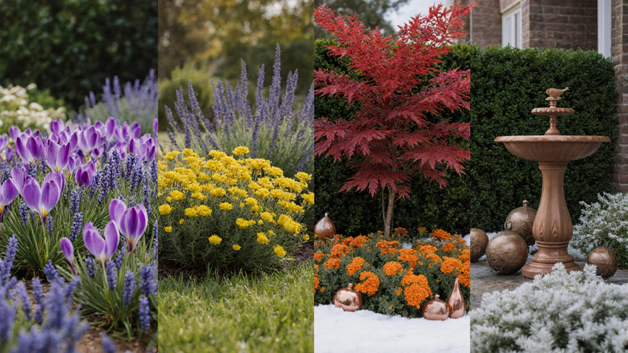
Seasonal Adjustments: Keeping the Palette Fresh Year‑Round
Plants change colour through the seasons, so a garden that looks great in summer may feel dull in winter. Here’s a quick seasonal cheat‑sheet:
- Spring: Add early‑blooming bulbs (e.g., crocus in purple) to support a yellow‑purple palette.
- Summer: Use heat‑tolerant annuals like marigolds (orange) alongside lavender for a blue‑orange mix.
- Autumn: Swap foliage plants for those with autumn colours-Japanese maple turning red against evergreen greens.
- Winter: Emphasise structural plants (boxwood, holly) and introduce evergreen ornaments in the accent colour (e.g., copper birdbaths for red‑green).
By rotating a few containers or annuals each season, you can keep the same complementary framework alive all year.
Common Pitfalls and Pro Tips
Even with a clear colour rule, mistakes happen. Avoid these common traps:
- Over‑accenting: Using the complement on more than 20‑30% of the garden can feel jarring. Keep the accent to clumps, borders, or focal points.
- Ignoring texture: Pairing two flat‑leaf plants can look flat. Mix foliage textures-feathery ferns with leathery boxwood-to add depth.
- Forgetting light conditions: Some colors (like deep purple) fade in full sun. Choose sun‑tolerant varieties (e.g., Salvia) for sunny spots.
Pro tip: Sketch your garden on graph paper, colour the dominant zones, then add small dots for accent plants. The visual guide helps you stay within the 30% rule before any digging begins.
Frequently Asked Questions
Can I use more than one complementary pair in the same garden?
Yes, but treat each pair as a distinct zone. For example, a front border could be red‑green while a side patio follows blue‑orange. Keep zones separated by a neutral element-like a gravel walk-to avoid colour clash.
What if I live in a shade‑heavy garden?
Choose shades that work in low light, such as deep purple hostas for a yellow‑purple scheme, or dark‑green ferns with red‑leafed variegated begonias for a red‑green palette.
How do I maintain colour balance as plants mature?
Prune regularly to keep size ratios in check. If a dominant plant overruns the space, thin it back and replace the gap with a complementary‑colored filler.
Are there budget‑friendly ways to add accent colour?
Yes-use seasonal annuals, repurposed painted pots, or inexpensive garden ornaments bought from local markets. Even a handful of brightly coloured bulbs can make a big impact.
Do complementary colours work for container gardens?
Absolutely. Place a deep‑red potted geranium against a background of green succulents, or use orange marigolds in a blue‑white cactus pot for a striking balcony display.
