Best Landscape Palette: Choose the Right Colors for Amazing Outdoor Paintings
Ever stared at a blank canvas and wondered which colors will make a mountain look massive or a sky feel alive? The secret isn’t a magic brush—it’s a smart palette. Picking the right hues saves you time, cuts down on mixing mistakes, and gives your work that natural punch that catches the eye.
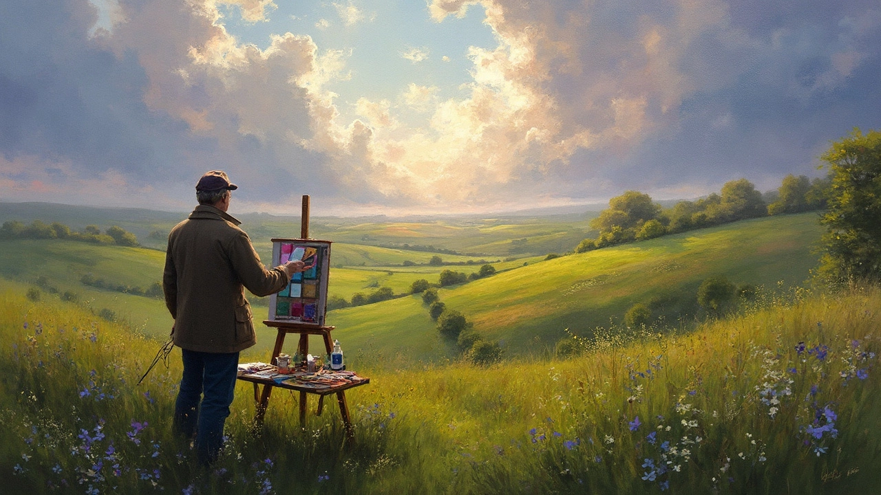
Why a Good Palette Matters
A landscape isn’t just a bunch of trees and sky; it’s light, atmosphere, and distance. When you start with colors that already mimic those qualities, you spend less time fighting the paint and more time shaping the scene. For example, a cool blue‑gray works better for distant mountains than a warm orange you’d use for a close‑up field. Using the right base tones helps you create depth instantly, and it keeps your color mixing simple because the hues already sit in the right temperature range.
Also, a focused palette keeps your painting from looking muddy. Throwing in too many reds, yellows, and greens at once can turn a sunrise into a confusing mess. A limited set of 6‑8 colors, chosen for their ability to mix a wide range of values, lets you maintain vibrancy while still having flexibility. Think of it as a toolbox: you only need the right tools, not every possible gadget.
Top Color Combos for Different Scenes
Sunrise and Early Light: Start with a warm lemon yellow, a soft peach, and a light titanium white. Add a touch of cadmium orange for the richer glow, and keep a cool ultramarine blue nearby for subtle shadows. Mixing the yellow and orange with a dash of blue gives you those pink‑purple clouds that look natural.
Midday Clear Skies: A pure ultramarine or cobalt blue mixed with a little cerulean works great for a bright sky. Pair it with a warm ochre or raw sienna for distant land, and keep a few earth tones—burnt umber and raw umber—ready for rocks and tree trunks. The contrast between the cool sky and warm earth creates that classic “daytime” feel.
Sunset and Evening: Grab a deep alizarin crimson, a cadmium red, and a rich yellow ochre. Blend them to get the orange‑red gradients that define a sunset horizon. Add a dab of violet or dioxazine purple for the sky’s darkest patches—these cool tones make the warm colors pop even more.
Forests and Woodlands: Use a mix of sap green, hooker's green, and a little yellow ochre for sunlight filtering through leaves. For bark, mix burnt sienna with a touch of ultramarine to get those cool‑warm brown tones. A tiny amount of cadmium red can simulate moss or lichens.
Desert and Arid Lands: Warm earth tones dominate here—raw sienna, burnt umber, and a hint of cadmium yellow. Mix a little white for sand highlights and a touch of ultramarine for distant shadows. The key is to keep the palette hot and dry; avoid blues unless you’re painting a distant mountain range.
Coastal and Ocean Views: Start with a deep cerulean blue, add a splash of phthalo green for turquoise water, and brighten with titanium white for foam. A small amount of burnt sienna or raw umber can give the water depth, especially where it meets the shore.
When you build these combos, keep a palette knife handy. Scraping colors together preserves the purity of each hue, making it easier to pull out the exact mix you need. Also, test your mixes on a scrap piece of paper before applying them to the canvas; a quick swatch tells you if the value or temperature is off.
Finally, don’t be afraid to adjust. If a sunset looks too orange, toss in a hint of violet. If a forest feels flat, add a cooler green for the back trees. The best palette is the one that lets you react to what the painting is telling you as you work.
Start with a simple set of colors, experiment with the combos above, and watch your landscapes gain depth, mood, and realism faster than you expected. Happy painting!
24 Jun 2025
Explore how to choose colours for landscape painting, with practical tips, science-backed facts, and examples. Discover what makes a palette truly work outdoors and how light, weather, and season affect your choices. Get actionable, creative advice for painting landscapes whether you’re a hobbyist or seasoned artist. Find out what pros keep in their paint box and how to make your scenes feel vibrant, real, and uniquely yours. This guide takes a deep and humorous dive—you'll never look at a field of green the same way again.
Continue reading...