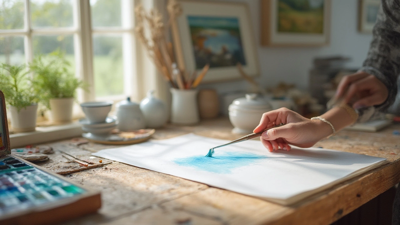
The excitement of facing a fresh, blank sheet of watercolor paper can be a little intimidating. Some say watercolor is unforgiving, but I’ll tell you: the real secret is that the order you paint in makes all the difference. Nobody wants those muddy colors or weird back-runs. Have you ever started on an eye in a portrait first, only to realize you should’ve blocked in the skin tones beforehand? There’s a rhythm to watercolor, and it’s not about perfection—it’s about building up those layers wisely. Knowing what to paint first can actually save your painting, not to mention your confidence.
Understanding the Nature of Watercolor Paint
Watercolor is basically painting with light—sounds romantic, but let’s get practical. The paint is transparent, which means your first decisions have a huge influence on the final look. When you slap that first layer down, you’re deciding which areas will stay light and which will deepen. There’s no paint-over-and-hope-for-the-best like with oils or acrylics. If you make the wrong call early, you might be stuck with it.
Watercolor’s transparency means every stroke stacks with the one before it. So if your first layer gets muddy, the whole thing will look washed out. Light reflects through each layer, bouncing off the white paper and shining back up. If you lay a dark color too soon, you lose that glowing effect. Watercolors rely on patience—a trait I’ll admit I had to learn the hard way. Each step counts. For instance, professional artists usually spend at least 30–40% of their painting time just planning the first few washes. That alone tells you how important those first moves are.
You also have to work with the drying time. When your first areas are wet, colors spread softly. If you paint new colors onto dry paper, you’ll get harder edges and more control. That dance between wet and dry is what gives watercolors their magic, but it’s also why order matters so much. If you think timing isn’t a big deal, just try painting a sky and adding the clouds afterward—those edges will look pasted on, not soft and dreamy.
Every paint brand and paper combo reacts a little differently. For example, a 2020 study by Jackson’s Art Supplies found that cotton paper lets for smoother gradations and richer color buildup than cellulose paper. So before you even pick up your brush, do a quick test on your scrap paper. That tells you how the paint will behave and whether you’ll need to work faster or slower for those first crucial washes.
The Importance of Planning: Sketching and Masking
Ever felt like you’re making it up as you go? That’s fun in some creative pursuits, but watercolor will punish you for it. Take five minutes and sketch a light outline first—seriously, it saves you from panic later! That initial graphite sketch should be detailed enough to map out all your large shapes and key highlights, but light enough that it won’t show through thin layers of paint. Most artists use an HB or 2H pencil for this job and keep the eraser handy.
Here’s something most beginners miss: mask off your highlights before you touch a brush to paper. Use masking fluid (also called frisket) on spots you want to keep pure white, such as sparkling water, candlelight, or reflections. If you haven’t tried masking before, it feels weird at first—like putting glue on your artwork. But it’s a game-changer. Once it dries, you can paint over everything and peel it away later, revealing crisp white details. People who skip this often end up overworking with white gouache later, which dulls the beautiful brightness of watercolor paper.
Planning shapes where your washes will go and which sections need to stay untouched makes painting less nerve-wracking. Working left-to-right (or top-to-bottom if you’re left-handed) helps stop accidental smudging from your hand. It’s also smart to always have a paper towel and clean water on standby—you will need to dab or lift paint here and there, and being prepared saves those lovely light spots from getting ruined.
What Should You Paint First? Light to Dark: The Golden Rule
Here’s the part everyone forgets because it sounds too simple: start with the lightest colors. This isn’t just a suggestion; it’s the backbone of every good watercolor. The reason is chemical and visual—once you put down a dark color, you can’t make it lighter without losing that glowing look. Every teacher, from Joseph Zbukvic to Hazel Soan, hammers this point. The most common mistake beginners make is jumping right into the details with dark paint. Then, oops, there’s no way to soften a shadow or recapture those bright highlights.
Watercolor painting thrives on translucency. Lay down your lightest overall washes first—think sky, distant hills, underpainting for skin. Use big, soft brushes and lots of diluted pigment. Don’t worry about details! Just cover the general areas where light will show. Wait for it to dry completely. This is usually called the "blocking in" phase, and it lays the foundation for everything else. Skip this, and you’ll wonder why your painting looks flat and lifeless.
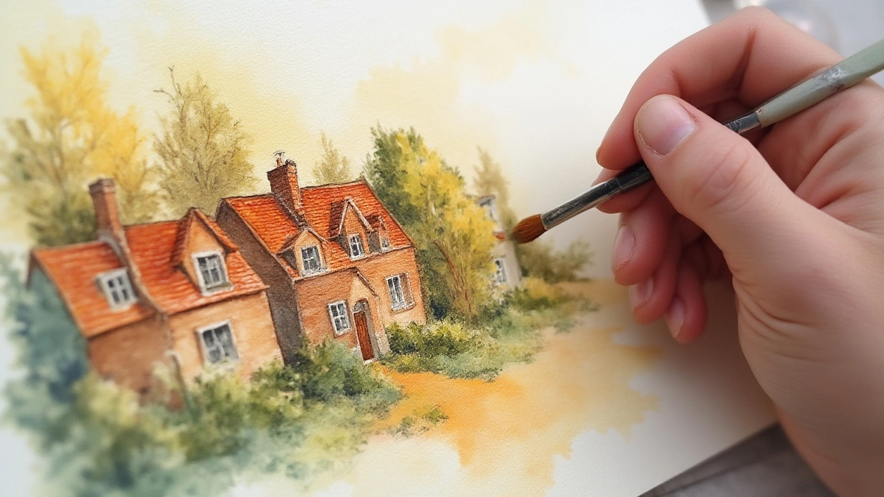
Once the first layer has dried, start building up midtones. These are the guts of your painting: local colors for trees, buildings, or clothing. This is where you add a sense of volume and form. A key fact: most artists avoid more than three or four layers, or the paint gets too muddy. Plan each one, and let it dry before the next.
Keep darkest darks for last. At this stage, you use a very small brush and saturated colors to add shadow and depth, punch in distant tree trunks, or define facial features. Adding darks first or too soon just kills that playful watercolor light. Try saving pure black, deep indigo, or dark green for the very end, when you know exactly where it belongs.
A 2018 survey of 150 watercolor artists by Artists Network found 85% start with a pale wash for maximum light. Only 5% ever paint the darkest sections first—and those were usually doing experimental, abstract work. You don’t have to play by the rules, but the pros follow this sequence for a reason.
| Step | What To Do | Common Mistake |
|---|---|---|
| 1. Plan & Sketch | Light pencil outline, mask highlights | Sketch too dark, skipping shapes |
| 2. Block-In Wash | Light, broad washes | Using too much pigment, muddy tones |
| 3. Midtones | Add shape, structure | Painting details too early |
| 4. Darks & Details | Last—tighten shadows, crisp lines | Jumping to darks first |
Layering Technique: How to Build Up Color Without Mud
Layering is where most beginners get nervous. But it’s what gives watercolor that luminous, glowing effect. Each time you put a transparent color over another, you’re building visual depth. But do it wrong and you’ll get grayish mud. Patience is the not-so-secret trick here. Let each layer dry thoroughly before adding the next. If the previous wash is even a little damp, your colors will bleed into each other, which is fun sometimes (sky washes, backgrounds)—but not when you want a crisp edge or a clean transition.
The first few layers should be super diluted. Think watery lemon or pale rose—not punchy. After the base dries, you can increase the strength. Try glazing a transparent blue over a dry yellow wash for a luminous green—chemists call this "optical mixing," and it’s what the old masters relied on back when paint colors were limited. This is one reason why paintings from the 1800s still look fresh—the artist built up glowing shades using minimal pigments.
Can you fix a washed-out area? Kind of. You can glaze a stronger color on top to darken, but you can never lighten it again. Save your rich colors for last. Use a smaller brush for details. If you need to lift out paint (to make a cloud or a highlight), dampen your brush, dab gently, and blot with a towel. The earlier you catch it, the more likely the pigment will come up without a stain. Some modern brands, like Schmincke or Winsor & Newton Professional, have more "lifting" ability than others.
Try not to fiddle too much. The more you scrub, the duller things get. Trust me: the most breathtaking watercolors ever painted usually look a bit awkward after Layer One. The magic is in the buildup—and in not panicking if it looks weird halfway through.

Tips, Tricks, and Mistakes to Avoid
Let’s talk about pitfalls every beginner (and plenty of experienced folks) fall into. First, don’t let your palette get messy—dirty mixing will sabotage your colors before they even touch the paper. Clean your brush whenever you switch colors, and wipe your palette between sessions.
Second, water control is king. Not enough water, and your washes will look streaky or harsh. Too much, and the paint will run out of control. When you load your brush, test it on scrap—there should be a "belly" of water and pigment, not a sopping wet mess. Tilt your board slightly so excess water moves in one direction; this gives you a beautiful gradient and helps prevent pooling.
Keep a spray bottle near your palette. If you notice your hair-dryer is making paint run all over, you’re probably blowing too soon. Let layers air dry—unless you want effects like blooms or backruns, in which case a little misting can add cool visual interest.
Save details and accents for last. Don’t even let yourself look at the tiny eye reflections or fence posts until everything else is dry. Otherwise, your painting becomes a delicate operation of painting around a hundred small shapes—which just adds stress and can look stiff.
Don’t be afraid to make mistakes. Half the artists you see in fancy books have stacks of rejected paintings—they only show you the best ten percent. Remember: every slip is a lesson, and some "mistakes" turn into happy accidents (seriously, damp trees in the distance? Accidental perfection). And if you really mess up? Flip the paper over and try again. Watercolor paper has two usable sides most of the time.
- Always use clean water and a clean palette.
- Don’t use black from the tube for shadows—mix cool blues and warm browns instead, for more lively darks.
- Test colors and value intensity on a scrap before going into your painting. Paint dries lighter than it looks when wet.
- Don’t let the paper buckle—tape or stretch it before you start if you’re using lots of water.
- If you want perfectly circular blooms, tap a drop of clean water into a drying wash—a little chaos, on purpose, often looks more artistic than rigid control.
So next time you sit down to paint, remember: have a plan, start light, build slow, layer with confidence, and above all, enjoy those surprises only watercolor can deliver. That magic—the light filtering through pure pigment—only happens when you respect the order of painting. Happy experimenting; let the colors do their dance before you worry about every tiny detail.