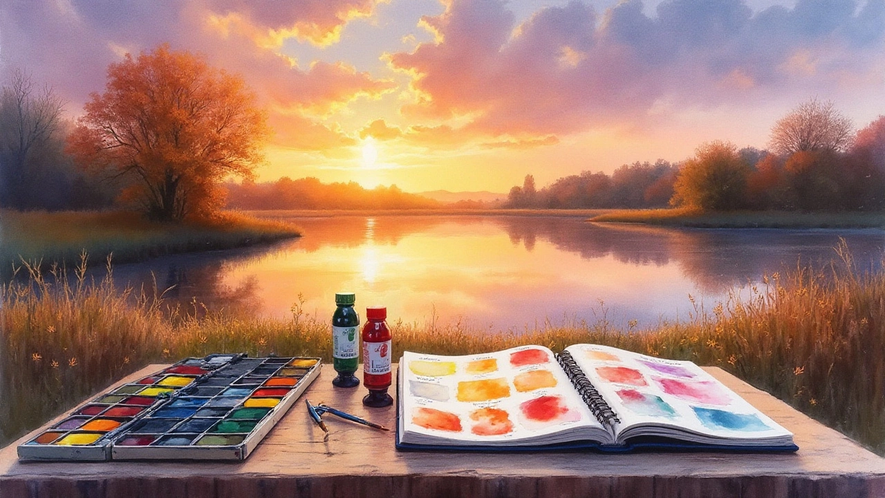
Diving into the wonderful world of watercolor painting can be both exhilarating and somewhat overwhelming. With so many colors to choose from, where do you begin? For beginners, starting with a curated palette of specific colors not only simplifies the learning curve but also fosters creativity.
Watercolors, with their fluid and translucent beauty, require a thoughtful approach to color selection. By focusing on a small range of essential colors, you can achieve a wide spectrum of hues and tones. These foundational colors are crucial, as they form the basis from which more complex artworks are crafted. Just like learning to cook with staple ingredients, mastering a few versatile colors can elevate your paintings, unleashing endless possibilities.
- Understanding Primary Colors
- The Importance of Secondary Colors
- Neutral Tones and Their Uses
- Learning to Mix Colors
Understanding Primary Colors
When you embark on the journey of watercolor painting, one of the first things you learn about is the importance of primary colors. These colors are the cornerstone of your palette, acting as the building blocks from which all other colors are created. The three primary colors—red, yellow, and blue—sit at the heart of the color wheel and are defined as those that cannot be created by mixing other colors. Understanding their unique roles and interactions opens doors to an endless world of color possibilities and combinations.
In the realm of watercolors, the choice of specific shades matters immensely. For instance, when selecting a red, you might opt for a warm hue like cadmium red or a cooler tone such as alizarin crimson. Both serve different purposes, with cadmium red often being bolder and more opaque, while alizarin crimson offers a subtler, cooler influence. The selection impacts not just the color itself, but also the mood and temperament of the entire painting, influencing how adjacent colors behave.
Equally critical is the choice of blue. A choice between ultramarine blue and Prussian blue offers different outcomes; ultramarine blue, with its warm depth, works well for creating rich skies and deep shadows. Prussian blue, on the other hand, is deep and dark, suitable for more dramatic contrasts and cooler compositions. These subtleties demonstrate that while colors like red, yellow, and blue appear simple, their implications on an artist’s work are profound and multi-layered.
It's fascinating how simple mixing rules dictate the turn of seemingly straightforward colors into complex systems of art. As artist and educator Jane Blundell once said,
"The key to unlocking the potential of watercolors lies in understanding your primaries."She emphasizes the importance of mastering these basic elements before moving on to a more elaborate color palette. Ensuring that these primary colors harmonize and blend well demands an artistic eye and an experimental spirit. By repeatedly exploring how these colors mix, a painter amplifies the dynamics of their technique and artistic expression.
The careful study of primary colors also leads naturally to the development of secondary and tertiary hues. This exploration reveals that achieving a range of colors is not about owning many tubes of paint, but rather understanding the different values and opacities that can emerge from just three basic ones. This foundational knowledge paves the way for confidence in experimentation, encouraging beginners to push boundaries and try new things. The simplicity of starting with these three makes the often daunting prospect of diving into watercolor painting seem accessible and exciting for any budding artist.

The Importance of Secondary Colors
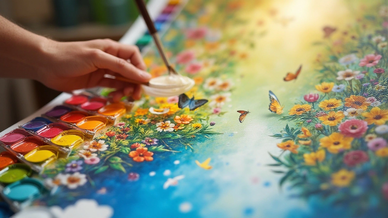
When you venture beyond the primary colors, a whole new world of possibilities opens up in your watercolor practice. Secondary colors—green, orange, and purple—are created by mixing two primary colors. These colors are not just the result of color theory exercises; they are crucial in achieving depth, mood, and harmony in your artwork. For beginner painters, understanding and using secondary colors can be a game-changer. Not only do they provide a more comprehensive palette, but they also enhance the vibrancy and dynamic range of your creations. These colors are often found in nature, making them essential for landscapes and floral compositions. Incorporating these hues allows you to depict scenes with a closer resemblance to reality, creating a smoother transition between elements. By blending secondary colors, artists are empowered to interpret the world with more versatility and expressiveness.
The creation of secondary colors can involve exploring different ratios of primary colors. For instance, varying the amounts of blue and yellow can yield a wide spectrum of greens, from lime to forest green. A similar methodology applies to orange and purple, where the hues can be adjusted to suit the specific needs of the artwork, from fiery sunsets to serene lavender fields. This level of control over color mixing is empowering for newcomers, offering them a tangible way to navigate the subtleties of watercolor. The importance of mastering secondary colors cannot be overstated; they are central to crafting works that feel complete and nuanced. As artists experiment, they learn to anticipate how these mixtures interact with the water on the page, paving the way for more complex and layered pieces.
Something magical happens when secondary colors are used strategically. They can serve to draw the eye, balance a composition, or provide contrast against primary hues. The beauty of watercolors lies in the unpredictable manner in which colors meld and flow, and secondary colors play a pivotal role in this dance. They introduce a certain level of fluidity, a visual softness that is often the trademark of watercolor art. It’s not uncommon to hear art instructors emphasize the practice of blending and experimenting with these colors. As renowned watercolorist John Singer Sargent once implied, it’s the handling and understanding of subtle tones that can hook an observer’s interest.
"Color is an age in nature's beauty," Sargent remarked, suggesting that embracing a wider spectrum could elevate the essence of one's work.The incorporation of secondary colors aids in bridging areas of extreme lights and darks, allowing for a more seamless integration of visual elements. When secondary colors are appreciated and harnessed, they truly elevate the story being told through a painting.

Neutral Tones and Their Uses
Neutral tones in watercolor painting hold a unique position, serving as the perfect balancers that bring harmony to your artwork. These colors, which include shades like grey, brown, and muted earth tones, have the magical ability to set the mood and context for your paintings. While they may not stand out as vividly as primary or secondary colors, their subtleness plays a crucial role in providing depth and dimension. Neutrals can suggest forms and shadows more subtly than bold shades and can evoke emotions without overpowering your central theme.
Using neutral tones effectively involves understanding their impact on the viewer's perception. For instance, a well-placed shadow under a tree can provide a sense of realism that transports the audience to a serene landscape. You might find that incorporating neutral tones can emphasize the vibrant colors of your subject, making the bright hues pop even more. It's interesting to note that these hues can be mixed into practically any color palette, offering an infinite range of possibilities. A canvas full of vivid colors could become overwhelming, but a splash of grey or ochre can breathe balance and sophistication into the painting.
Mixing Neutrals: The Art of Subtlety
The beauty of neutral tones lies in their versatility and their ability to be custom-blended to achieve the desired effect. Mixing complementary colors, such as blue and orange or red and green, can create an array of unique neutrals tailored to suit your specific needs. For beginners, creating these neutrals might feel daunting initially, but with practice, the ability to mix and adjust tones will become second nature. As many artists say, patience is key to unlocking the full potential of your palette.
Renowned watercolor artist Jean Haines articulates, "Neutrals may speak softly, but they listen hard—they are the silent reminders in art that less is often more." Her sentiment encapsulates the idea that these tones, though understated, can articulate feelings and themes that stand the test of time. By gently altering the mix of neutral tones, artists can evoke a range of emotions, from tranquility to melancholia, each subtly compelling the viewer.
| Desired Neutral Effect | Mix of Colors |
|---|---|
| Warm Greys | Ultramarine Blue + Burnt Sienna |
| Muted Greens | Viridian + Cadmium Orange |
| Earthy Browns | Crimson + Sap Green |
In conclusion, don't shy away from experimenting with neutral tones. Allow them to guide the emotion and depth of your painting, enhancing its narrative. Recognize that within these softer shades lies the power to transform and elevate your artwork, adding layers of meaning without uttering a word. It's this subtlety that often resonates most deeply with those who view your works, leaving a lingering impression long after they've left the page.

Learning to Mix Colors
When you're just starting in watercolor painting, one of the marvels you soon discover is the art of mixing colors. It might seem a bit mysterious at first, almost like creating potions. But with a little practice, it becomes second nature, a joy that adds another layer of magic to your artwork. Mixing colors is all about understanding how pigments interact. This knowledge can transform your approach to creating depth and vibrancy on paper. Mixing isn't just about combining two colors to get a third. It's also about the adventure of discovering what's possible when pigments blend in unexpected ways.
The basics start with your primaries—red, blue, and yellow. From these, a whole spectrum is birthed. By adjusting the ratio of the colors, you can achieve secondary colors like green, purple, and orange. The trick lies in the subtle variations of these mixtures. You can create a spectrum that feels considered and sophisticated, even with just a few colors. Pay close attention to the amount of water you incorporate, as it can drastically change the tone and transparency of the color. Noted watercolorist John Singer Sargent once said,
"Watercolors are a swim in the metaphysical."His words remind us that the medium's fluidity is its strength, allowing for spontaneous and vibrant expressions.
Let's discuss a few practical tips to refine your mixing technique. Start by experimenting on a piece of scrap watercolor paper. This allows you to see how your colors interact without affecting your main artwork. Observe how pigments react to each other in both wet and dry states. The wet-on-wet technique can create beautiful gradients and mixed colors, ideal for softer transitions. On the other hand, the wet-on-dry technique provides more control, perfect for when you need distinct shapes and lines. Remember, patience is key. Allow your watercolor layers to dry fully before applying additional layers to avoid unintentional blending.
Now, let's dive into some advanced strategies. Experiment with glazing by painting thin layers of one color over another when the bottom layer is dry. This method can deepen the artwork's colors and add complexity without muddying your original hues. Additionally, consider the value scale. Mixing black or white is generally avoided, as it can dull the vibrancy. Instead, adjust the water content to create light or dark versions of a color. This approach maintains the freshness and brightness that watercolors are renowned for. Sometimes, unexpected results happen, encouraging unique creativity.
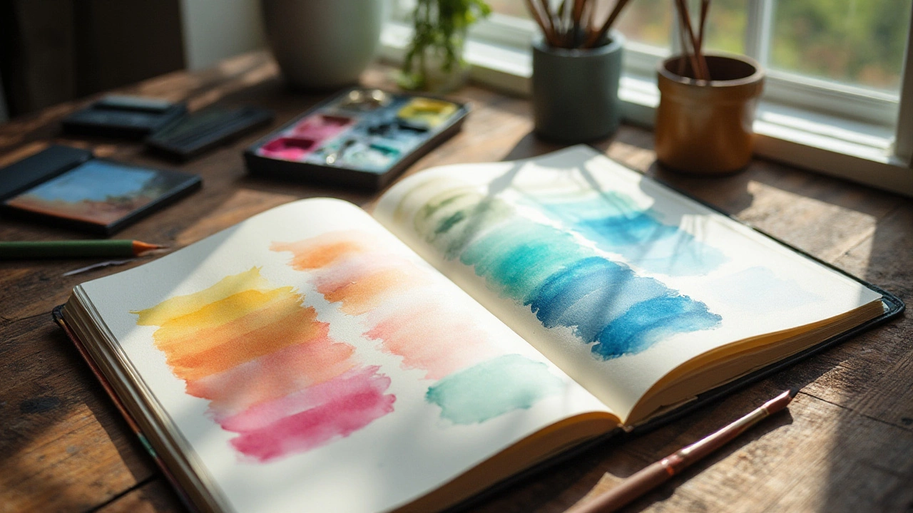
The joy of color mixing lies in both the familiar and unexpected. As you build your experience, you'll discover reliable combinations that you return to repeatedly. However, don't be afraid to venture into new territory. Keeping a journal of mixtures you create can be extremely useful. Documenting these discoveries not only builds a reference for future projects but also aids in understanding your personal color preferences and how they translate into your art. Engaging with color at this level enhances both your skill and appreciation for the medium. Like any good adventure, it's not just about the destination but the delightful journey along the way.

